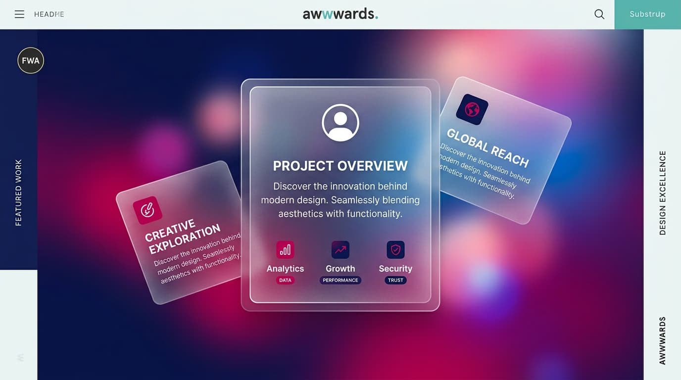
Glassmorphism is a UI design style that mimics frosted glass surfaces layered over colorful backgrounds. It's defined by three key characteristics: transparency with a background blur, thin borders, and vibrant gradients underneath the surface. Apple brought it to the mainstream in 2020 with macOS Big Sur and iOS 14, and after several years of evolution, it remains one of the most recognizable UI styles today.
In this article, we'll cover what it really is (beyond the aesthetic), how to implement it correctly in CSS, see real-world examples from products that use it intelligently, and learn when it makes sense to adopt it in your projects—and just as importantly, when to avoid it for accessibility or performance reasons.
What Exactly Is Glassmorphism?
Glassmorphism is a direct descendant of two previous trends: flat design (from which it inherits its minimalist feel) and neumorphism (which sparked interest in soft, three-dimensional effects). Technically, it's characterized by:
- A semi-transparent background with a typical opacity between 5% and 30%
- A background blur between 10px and 40px that blurs whatever is underneath
- A thin, 1px border in white with 10-30% opacity to define the edge of the surface
- A very colorful background behind the element, often a gradient or a saturated image
- A subtle drop shadow to lift the surface off the background
The result is the feeling of looking through a frosted glass pane—hence the name glassmorphism. It's a purely aesthetic effect: it doesn't communicate hierarchy or state like skeuomorphism, but it reinforces the visual structure when layered over dense content.

Clean CSS Implementation
The core of the glassmorphism effect is the CSS backdrop-filter property. Here’s a minimal glass component:
.glass-card {
  background: rgba(255, 255, 255, 0.12);
  backdrop-filter: blur(20px) saturate(180%);
  -webkit-backdrop-filter: blur(20px) saturate(180%);
  border: 1px solid rgba(255, 255, 255, 0.20);
  border-radius: 16px;
  box-shadow: 0 8px 32px rgba(0, 0, 0, 0.18);
}
The saturate(180%) trick is what separates a vibrant glass effect from a dull one. It boosts the colors beneath the blurred surface, making the effect more intense. Without saturation, the blur tends to wash out the underlying colors.
Browser compatibility is excellent today: Chrome, Edge, Safari, and Firefox all support backdrop-filter. The -webkit- prefix is still needed for Safari on iOS versions older than 15. For older browsers, be sure to provide a solid background color as a fallback.
Real-World Examples from Top Products
Apple — macOS and iOS
Apple uses glassmorphism extensively in the Finder sidebar, Control Center, and system notifications. The macOS implementation is particularly interesting because the blur is dynamic, adapting to the wallpaper underneath. This requires the OS to know the content behind the surface—a level of integration that web apps can only approximate.
Microsoft — Fluent Design (Mica and Acrylic)
Windows 11 introduced Mica and Acrylic, two variations of the glass effect. Acrylic is classic glassmorphism (blur + transparency). Mica is more subtle: it samples the dominant color from the desktop wallpaper and applies it as an opaque tint, which is less resource-intensive.
Web — Stripe, Vercel, Linear
In web products, Stripe uses glass panels in its dashboard. Vercel uses them for modals and cards on its landing pages. Linear applies the effect to its command palette. The common pattern is to place glass elements over colorful, animated backgrounds (like gradients or blobs) with highly readable content on top.
When to Use Glassmorphism in Your Projects
Three scenarios where glassmorphism really shines:
1. Cards over rich hero images. On a landing page with a full-screen background photo, a glassmorphism sign-up card can separate the form from the background without completely obscuring it.
2. Sidebars and command palettes in productivity apps. When a sidebar needs to coexist with a busy canvas (e.g., in Figma or Notion), the glass effect adds depth without visually cluttering the main workspace.
3. Modals and tooltips. For temporary overlays where you want the user to maintain a sense of context, knowing the underlying content is still there.
When to Avoid Glassmorphism
Three scenarios where glassmorphism creates problems:
1. Forms and dense text content. Readability suffers when text has to compete with a blurry, variable background. WCAG guidelines require a minimum contrast ratio of 4.5:1 for text, which is very difficult to guarantee on a glass surface if the background changes.
2. Low-performance or low-power devices. The blur effect is GPU-intensive. On entry-level monitors or devices with low battery, it can cause lag or drain power.
3. Serious or conservative brands. Banks, government institutions, and professional services might appear frivolous using glassmorphism. The frosted glass look communicates a 'consumer tech' vibe, not an 'enterprise' one.
Accessibility: The 3 Must-Haves
Glassmorphism and accessibility have a tense relationship. To avoid excluding users, follow these rules:
- Always ensure sufficient text contrast. Test every text and background combination with tools like the WebAIM Contrast Checker. Don't trust your eyes.
- Respect
prefers-reduced-transparency. Users can request reduced transparency in their OS settings for accessibility reasons. Use the@media (prefers-reduced-transparency: reduce)media query in CSS to provide a solid, opaque fallback. - Provide an opaque fallback for older browsers. The small percentage of users on browsers that don't support
backdrop-filterstill deserve a usable experience.
How to Create Glassmorphism in Figma
Figma has native support for the glassmorphism effect:
- Create a rectangle, set its fill to white, and lower the layer opacity to 12-15%
- In the "Effects" panel, add a Background blur with a value between 20 and 30
- Add a 1px stroke, set it to white, and lower its opacity to 20%
- Apply a soft drop shadow underneath
The limitation in Figma compared to code is that the blur is static—it doesn't see the actual content layered beneath it. This can make prototypes look less 'alive' than the final product. To validate the real look and feel, you'll need to test it in a coded prototype.
Frequently Asked Questions (FAQ)
Does backdrop-filter slow down animations?
Yes, it can. Blurring is a GPU-intensive operation. On elements that are being animated (e.g., dragged, scaled, or faded), it can cause 'jank' and drop the frame rate from a smooth 60 FPS to a stuttering 30 FPS. To mitigate this, you can hint to the browser by applying CSS properties like will-change: transform and backface-visibility: hidden.
Does it work well on mobile?
iOS handles it natively and very well, as Safari has had excellent support for years. On Android, Chrome supports it, but the blur effect can slow down scrolling on entry-level devices, especially with blur values over 20px. Consider using a more subtle blur (10-15px) on mobile.
Glassmorphism vs. Neumorphism: Which is better?
Neumorphism had its moment but suffers from fundamental contrast and accessibility issues. Glassmorphism is more versatile; it works well over colorful backgrounds, whereas neumorphism requires a nearly monochromatic palette. Today, glassmorphism has far wider adoption.
How does it work in dark mode?
It works beautifully if designed correctly. A dark background with blurred, colorful accents can create a very premium feel. Just remember to change the border color from white to a light gray (e.g., rgba(255, 255, 255, 0.1)) and re-check all your text contrast ratios.
Is it just a passing trend?
Visual trends in digital design typically last 5-7 years (think of flat design's reign from roughly 2013-2019). Glassmorphism emerged around 2020. We expect it to remain relevant for a few more years before declining. Adopt it if it adds real value to your UI, not just to follow a trend.
Next Steps
Learning to use glassmorphism (and other UI trends) professionally requires a solid foundation in visual design—hierarchy, contrast, typography, and color systems. The UI & Visual Design Course from CorsoUX covers 12 chapters with 101 lessons: from theory to hands-on practice in Figma, all the way to building a complete design system. You'll get 1:1 mentor feedback on every exercise.
To dive deeper into UI trends and principles, also check out our guides on how to design effective UI animations, how to choose fonts for your interface, and the 7 Gestalt principles applied to design.


