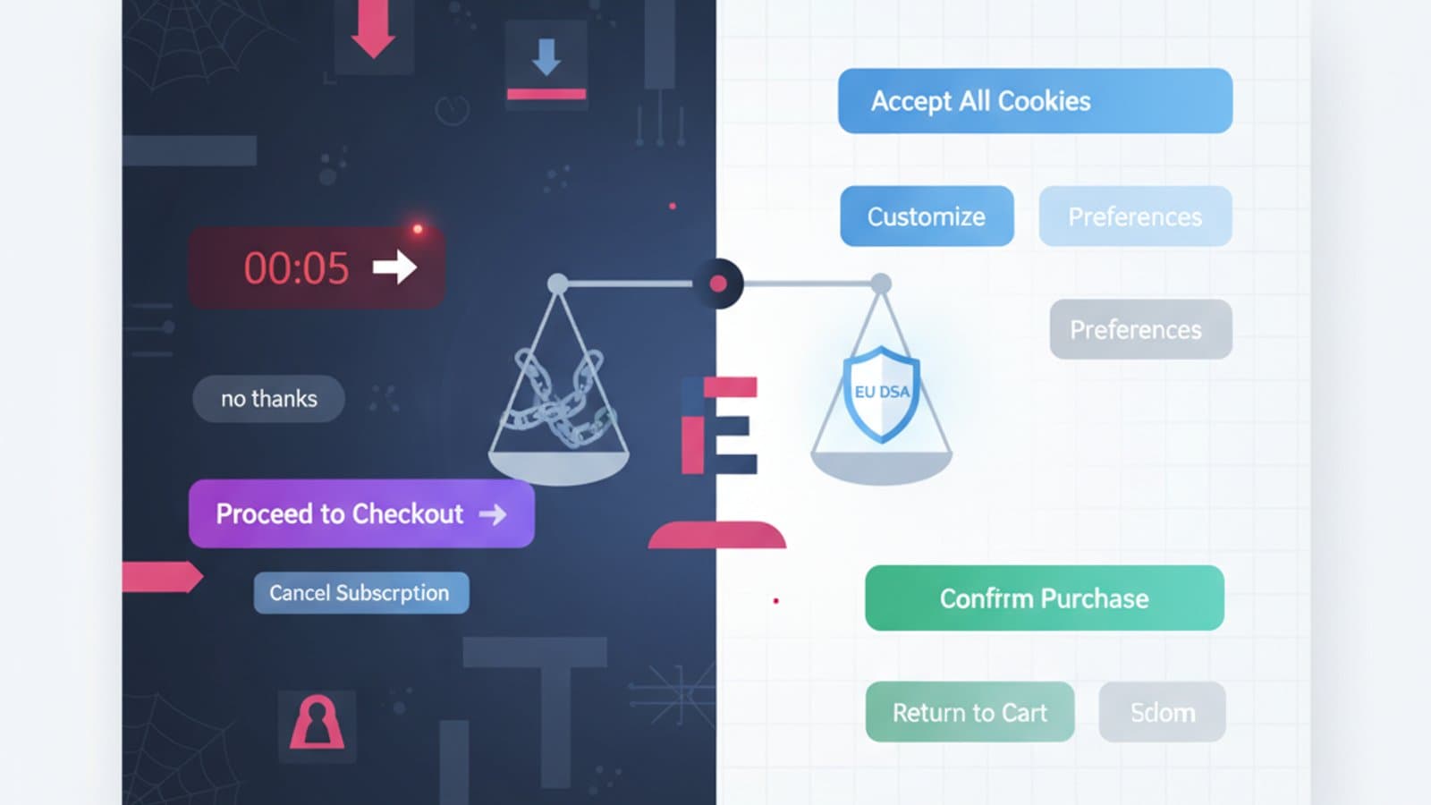
As of June 28, 2025, the European Accessibility Act (EAA) becomes mandatory for many digital services offered to EU citizens, including e-commerce, online banking, and transportation. Non-compliance can lead to significant fines—and the technical framework for compliance is the Web Content Accessibility Guidelines (WCAG) 2.2.
If you design interfaces in 2026, knowing WCAG is no longer optional; it's a professional requirement. This guide contains everything a designer needs to know to be compliant, written as an operational handbook—no bureaucratic jargon, just concrete examples of mistakes and solutions.
What you'll learn:
- What WCAG are and who they apply to in 2026
- The 4 core principles (POUR) explained with examples
- The difference between the 3 conformance levels (A, AA, AAA)
- The 9 new success criteria in WCAG 2.2 vs. 2.1
- An actionable checklist to audit your interfaces
- Free testing tools to integrate into your workflow
What are the WCAG?
The Web Content Accessibility Guidelines are the international standard for making web content accessible to people with disabilities—including visual, motor, auditory, and cognitive impairments. They are published by the W3C (the consortium that governs web standards) and are updated periodically.
The current version is WCAG 2.2, published as a W3C Recommendation on October 5, 2023. It replaces WCAG 2.1 (2018) by adding 9 new success criteria to address needs that have emerged with the rise of touch devices, cognitive disabilities, and limited mobility.
WCAG 2.2 is:
- Backward compatible with WCAG 2.1: everything that was valid still is
- Technically testable: each criterion is written as a pass/fail test
- Technology-independent: it applies to HTML, PDFs, native apps, and digital documents
- Legally required in the EU from June 28, 2025, for services covered by the EAA, and the basis for laws like Section 508 in the US
WCAG isn't just bureaucracy: every criterion exists because, without it, a group of people cannot use your product. Designing for accessibility isn't a favor—it's just good design.
The 4 POUR Principles
WCAG 2.2 organizes all accessibility criteria under four principles. The mnemonic acronym is POUR:
P — Perceivable
Content must be presentable to users in ways they can perceive.
A concrete example: an image without an alt attribute is invisible to screen reader users. A video without captions is inaccessible to deaf users. Text with insufficient contrast is unreadable for people with low vision.
Key criteria:
- Text Alternatives: Every informative image has a descriptive
altattribute; decorative images havealt="" - Color Contrast: Text must have a contrast ratio of at least 4.5:1 (Level AA), or 3:1 for large text. WCAG 2.2 also requires non-text UI controls to have a contrast of at least 3:1
- Resize text: Users must be able to zoom text up to 200% without loss of content or functionality
- Audio/Video: Videos must have captions for all spoken content; audio-only content must have a transcript
O — Operable
All functionality must be available from a keyboard.
Millions of people navigate using only a keyboard, assistive switches, or voice control. If your interface requires a mouse hover to access a menu, a keyboard user cannot operate it.
Key criteria:
- Keyboard Accessible: Every action must be reachable with Tab, Enter, Space, and arrow keys. No "keyboard traps"
- Focus Visible: The active element must be clearly highlighted (which is why removing
:focuswithoutline:noneis a common violation) - Enough Time: If there is a time limit, the user must be able to extend or disable it
- Target Size (Minimum) (WCAG 2.2): Buttons and clickable links must be at least 24×24 pixels—a new criterion designed for users with tremors or motor difficulties
- No Seizures: No content should flash more than three times per second (risk of epilepsy)
U — Understandable
Information and the operation of the user interface must be understandable.
Key criteria:
- Language of Page: The HTML must have the correct language attribute, e.g.,
<html lang="en"> - Predictable: A component should not change the context without an explicit user action (e.g., no page changes on focus)
- Input Assistance: Forms must have clear labels, specific error messages, and contextual help
- Error Suggestion: If a user makes an error, the message must explain what is wrong and how to fix it, not just "Error"
R — Robust
Content must be robust enough that it can be interpreted by a wide variety of user agents, including assistive technologies.
Key criteria:
- Valid HTML: Tags must be properly closed, attributes well-formed, no parsing errors
- Name, Role, Value: Every interactive element must have a name (label), role (button, link, input), and value (state). This is the job of ARIA
- Status Messages (WCAG 2.1): Confirmation, error, or progress messages must be announced by screen readers without stealing focus
The 3 Levels of Conformance
Each WCAG criterion is assigned one of three levels:
| Level | When it applies | Practical Example |
|---|---|---|
| A | Absolute minimum—without it, some users cannot access the content at all | Alt text on images; no keyboard traps |
| AA | The industry standard required by most regulations worldwide | 4.5:1 contrast ratio; 24×24px target size |
| AAA | Highest level, for specialized sites (e.g., for government services) | 7:1 contrast ratio; sign language for all videos |
The target level for most projects in 2026 is AA. It's what's required by the European Accessibility Act, Section 508 in the US, and Canada's AODA. Level AAA is a bonus for sites with specific user bases (e.g., severe visual impairments), but it's very restrictive and not always compatible with brand design choices.
The 9 New Features in WCAG 2.2
WCAG 2.2 adds 9 new success criteria. Here are the 5 most important ones for designers:
1. Focus Not Obscured (Minimum) (2.4.11, Level AA)
When an element receives keyboard focus, it must be fully visible. It cannot be partially or totally hidden by sticky headers, cookie banners, or chat widgets.
Common mistake: An 80px tall sticky navbar that covers the form field that just received focus. The keyboard user can't see what they're typing.
The fix: Add scroll-padding-top: 80px to the CSS or manage the scroll on focus via JavaScript.
2. Target Size (Minimum) (2.5.8, Level AA)
Buttons and clickable links must have a target area of at least 24×24 pixels. The text itself can be smaller, but the clickable area must meet the minimum size.
Common mistake: Social media icons in a footer that are only 16×16 pixels. These are inaccessible to users with motor tremors.
The fix: Increase the padding of the clickable element or use a pseudo-element like ::before to expand the target area.
3. Consistent Help (3.2.6, Level A)
If your interface provides help mechanisms (e.g., a contact form, chat widget, FAQ link), they must appear in the same relative place on every page. The user shouldn't have to hunt for them.
Common mistake: A "Help" link in the top-right on the homepage, in the footer during checkout, and hidden in a hamburger menu on a product page.
4. Redundant Entry (3.3.7, Level A)
If you ask a user for information they have already provided in a previous step of the same process, you must either pre-populate it or make it available for auto-completion.
Common mistake: A 3-step checkout that asks for an email in step 1, then asks for a "billing email" in step 3 without pre-filling it.
5. Accessible Authentication (Minimum) (3.3.8, Level AA)
Login processes cannot require a user to perform a cognitive function test, such as memorizing, transcribing, or solving a puzzle (e.g., typing characters from a CAPTCHA image). Alternatives must be available, such as biometrics, password managers, or email links.
This criterion fights "cognitive walls" in logins—barriers that exclude people with cognitive disabilities or dyslexia.
Actionable WCAG 2.2 Checklist (Level AA)
Use this checklist before launching any interface. It's the operational version, not the official W3C version.
Perceivable:
- Every informative
<img>has a descriptivealt - Every decorative
<img>hasalt="" - Text contrast is ≥ 4.5:1 (≥ 3:1 for text ≥ 18pt)
- UI controls (buttons, fields, active icons) have ≥ 3:1 contrast with their surroundings
- Videos have captions, audio has a transcript
- The page is readable when zoomed to 200%
Operable:
- All actions can be completed with a keyboard only
- The focused element is always visible (custom
:focus-visibleor default) - No sticky headers obscure the focused element
- Buttons and links have a target size of ≥ 24×24px
- No content flashes more than 3 times per second
- A "Skip to content" link is present at the top of every page
Understandable:
-
<html lang="en">is set correctly - All inputs have labels (visible or via
aria-label) - Error messages indicate what is wrong and how to fix it
- Link text describes the destination (no "click here")
- Elements do not change context on focus
Robust:
- HTML is valid (passes W3C validator)
- Custom components have correct ARIA
role,aria-label, and states - Dynamic messages (toasts, alerts) use
aria-live
Free Accessibility Testing Tools
No automated tool can catch 100% of accessibility issues—Nielsen Norman Group studies estimate they find 30-40%—but they significantly reduce manual effort.
- axe DevTools: A Chrome/Firefox extension by Deque. It's free, has zero false positives, and is the industry standard. It analyzes a page and tells you exactly where the problems are and how to fix them.
- Lighthouse: Integrated into Chrome DevTools. It provides an accessibility score from 0 to 100. It's less precise than axe but good for a quick smoke test.
- WAVE: From WebAIM. It visualizes errors directly on the page. Useful for presenting issues to non-technical stakeholders.
- Stark: A Figma plugin that checks contrast and simulates color blindness as you design. Excellent for UI designers.
- WebAIM Contrast Checker: A simple web tool to verify the contrast ratio between two colors.
To learn more about accessible colors, read our guide on designing for color blindness.
Common Accessibility Mistakes in Digital Projects
These are the issues we find most often in client audits:
- Placeholders instead of labels: Placeholders disappear as soon as the user starts typing, and screen readers handle them inconsistently. Always use explicit
<label>elements. - Icons without text: A hamburger icon without an
aria-label="Menu"is invisible to a screen reader. An accessible name is required. - Carousels that can't be paused: Slideshows that auto-play without a "pause" button are inaccessible to people with cognitive disabilities who need more time to read.
- Custom dropdowns: Components built from scratch with
<div>instead of a native<select>are almost always broken for screen reader users. Use native HTML elements unless you are an ARIA expert. - Text on images without sufficient contrast: Hero banners with white text on a colorful photo. A semi-transparent dark overlay behind the text can easily fix this.
Frequently Asked Questions
Are WCAG 2.2 guidelines mandatory?
Yes, in many regions. As of June 28, 2025, they are the required standard for services under the European Accessibility Act. In the US, laws like the Americans with Disabilities Act (ADA) and Section 508 for federal agencies reference WCAG, making Level AA the de facto legal standard for digital accessibility. Non-compliance can result in lawsuits and significant fines.
What's the difference between WCAG 2.1 and 2.2?
WCAG 2.2 adds 9 new success criteria without removing or changing the previous ones. If you were compliant with 2.1, you only need to check against the 9 new criteria to become 2.2 compliant. The most impactful new criteria are Focus Not Obscured, Target Size (Minimum), Dragging Movements, and Accessible Authentication (Minimum).
How much does it cost to make an existing site accessible?
It depends on the site's current state and complexity. An initial audit can cost $2,000-$5,000 USD and identifies the necessary fixes. Remediation can range from $5,000 (for a small static site) to over $50,000 (for a complex e-commerce platform). It is always cheaper to design for accessibility from the start; retrofitting can cost 10 times more.
Can a non-technical designer work on accessibility?
Yes, and it's crucial. Around 80% of accessibility issues are design problems: contrast, text size, hierarchy, copy clarity, and component naming. The designer makes these decisions before a developer writes any code. A UX designer who knows WCAG can prevent most problems upstream, leaving the developer to focus on correct code implementation.
How can I learn WCAG in depth?
The official W3C documentation is comprehensive but dense. For a practical approach, read WebAIM's guides and articles from the Nielsen Norman Group. The book "Inclusive Design Patterns" by Heydon Pickering is an excellent hands-on manual. For a guided learning path, our UX Design course has an 8-hour module dedicated to practical accessibility with real-world exercises.
Next Steps
Accessibility is the skill that will most distinguish a senior designer in 2026. With regulations like the European Accessibility Act taking full effect, companies worldwide are actively seeking designers with WCAG experience and paying salary premiums—especially in finance, healthcare, and government sectors.
The complete UX Design course by CorsoUX includes a dedicated module on accessibility: applied WCAG 2.2 theory, hands-on audit exercises on real projects, Figma integration, and a final case study redesigning a non-compliant landing page. Upon completion, you'll have a credential with a specific focus on WCAG 2.2 and the European Accessibility Act.
In the meantime, to get started right away:
- Designing for Color Blindness — the visual side of accessibility
- Nielsen's 10 Usability Heuristics — fundamental principles that overlap with WCAG
- The Guide to Design Thinking — how to integrate accessibility into your design process