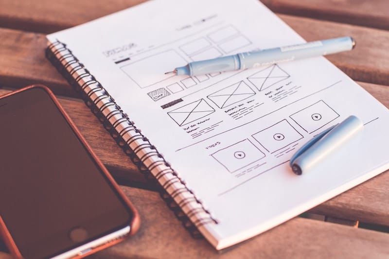
Today you will learn how to design UX search and filters. I have created this solution in only one day and, of course, it’s not complete (it might need more than a month, specially if we are going to consider a subject like Google AdWords). This solution just helped me to resume some of best practices for UX search design and filtering.
You can also take a look to these 34 UX Search Guidelines for Ecommerce websites
Search is like a conversation, it’s a bidirectional process between the user and system. It can be very rich as a real human conversation.
As you can imagine, search results are playing an important role in the search experience. The challenge is to help users find the specific information they are looking for. Here it is very important that you understand the UX search design purpose, as it is a matter of volume and type of content, and then you need to determine in which way the results are displayed: the risk is to waste screen space and omit important information.
As general steps you can follow this order:
- Establish the UX search design goal;
- Assign the proper area to the results and to the filters; and
- Organise the user experience of the results.
Try to think about a site where there are huge amounts of information (i.e. Google AdWords, eBay, and AirBnB). The website would be overwhelming without a very linear and organised search experience.

Credit: ux.stackexchange.com
So let’s look at some approaches to filtering down content, in terms of interaction and user interface architecture.
Table of Contents
UX Search Design: Choose the Proper Space
Sidebars
Filters were born as content situated on sidebars, either on the left or on the right. This old-style approach is good for when the intention of the users is to explore and select what they want or what they don’t want to see in the results.
Top Content
This is also a common practice to provide further filtering options on the top of the result pages.

Main Content
Many sites take a more experiential approach to filtering that can be used in the main content, with an immersive experience of filtering. This can feel very personal and helpful to find the right solution, increasing the experience service quotient for the user.
The new UX trend of designing a full screen search filtering is becoming quite popular and it is an attractive approach. Of course if the intent is for users to continue with the exploration and the navigation between pages to find many solutions, this may not be the right way to go.

Case study: Google AdWords
Following the best practices to develop the User Experience Strategy, before you start improving the UX, you must first understand the business core and come up with an answer for all the questions below:
- What problems does it solve?
- How does it make money?
- Where has it been successful?
- Where could it improve?
- What are the nature of the filters and the data presented?
- Why will users filter things in the first place? What data do they wish to find?
I have studied the Google AdWords pattern. Why? Because I used it and I didn’t like it. I still don’t like the way they developed the process to create campaigns. I believe this system has a poor usability and it’s too complicated for not-expert people.
I tried to understand their higher purpose and wrote down all the graphical improvements to use. I also interviewed four people, not experts but users of AdWords, and asked them for a simple list of three things to improve and what problems they found.
Common issues of UX Search filters.
The result was very similar among the respondents, both of them have complained of problems regarding the usability of the system:
- Scrolling Issues: Multiple problems are related to scrolling large windows. If your mouse cursor is outside of the window, you will most likely scroll down the entire page. Hiding the options from the screen is also problematic.
- Lack of overview during huge selections (i.e. languages or countries): Seeing more than 20 uncategorized options can be bewildering (image 2), and country drop-downs often offer hundreds of options;
- Inconsistent UI: The UI of drop-downs differs from browser to browser and OS to OS.
- Unclear sorting: When shown a massive list, the first thing users do is figure out the sorting logic. A good solution might be including the most popular options at the top;
- No Interactions with the results: Some people asked for a feature that shows (real-time or not) something about the power of the filters: like the results. I’m not going to be completely satisfied if my filter solution doesn’t show me the results (numbers!) and it takes 1-2 steps more.
- The Advanced Search: This is a big popup and it can’t allow you to select by continent or big areas that are not very “advanced”; just a little more than the standard view (images 3 and 4).
Here some images:


Some feedback from Jakob Nielsen about drop-downs testing with a large number of options, such as state and country lists:
Making users suffer a drop-down menu to enter state abbreviations is one of many small annoyances that add up to a less efficient, less pleasant user experience. It’s worth fixing as many of these usability irritants as you can.
Drop-down menus are often more trouble than they are worth and can be confusing because Web designers use them for several different purposes. Also, scrolling menus reduce usability when they prevent users from seeing all their options in a single glance.
My idea: Redesign the “Advanced Filters” page.
The worth of AdWords is based on showing the users how detailed the audience for an advert is. So “advanced filters” is an important part of the product’s purpose and we don’t need to use sidebars. We can develop the best user experience using the main content area of the page for the filters.
With a lean top-menu, it will be easy to focus the reader’s attention on the main content of the page. So I created four main areas:
- Top header which contains the static menu with the logo, main categories, settings, and user menu;
- Left sidebar to contain the navigation menu;
- Main content which is the main section to focus the attention of the user to the advanced filters.
- Right sidebar where we have the real-time result of our filter selection.

The easiest way to get rid of the hundreds of options and the issues related to scrolling is to simply replace the drop-down selections with a text search field and letting the user type what they like.
Auto-completion script and “Recent Added fields” are good candidates for helping the user. It’s also a nice touch to show the number of items available in each option.
Encourage exploration. Now for something even more challenging. While some users know exactly what they’re looking for, others will want the ability to explore the data in the system. Wouldn’t it be nice if they could lead the expedition themselves?
A good idea might be to display a continents selection, with popup information (i.e. how many people are reachable in the selected continent). It also might evolve in something more specific like a country and city selection.

Real-Time interactions and simplicity.
Give the user control over their viewing options and provide the ability to see the results in real-time (for example, the daily impressions) in the right sidebar space.
So if you can let users do it in few steps, why do you provide a step more? Why provide a filter button if you cannot have it?
It can save time: If a combination of two filters will yield no results (or unsatisfactory ones), the user won’t continue filling other filters. It can also help to promote serendipity – even if I didn’t mean to perform this specific query, the results may be useful for me.
In this case, you have to consider the technology to use, because filtering the data may take time (like it would on data-rich web applications), and the feasibility: If the live results are of no use, it can be annoying.
I also created the entire design using a modern design and colors, with notifications popping up to improve the interaction, simplifying as much as possible by inserting icons instead of text:
- Flags for languages;
- Logos for browsers and OS; and
- Icons for devices;
![]()
Conclusion
I have created this mockup in only one day and, of course, it’s not a definitive solution (it might need more work, especially if we are going to consider a subject like Google AdWords), but it just helped me to resume some of best practices for UX search and filtering. The study of the usability issues helps me to understand many things. These are all minor interruptions that don’t occur every single time for your audience. But they all add up, and together with other minor usability issues on your website, they will degrade the overall user experience .
Developing the best User Experience is not confined to sketching beautiful interfaces. It’s a process that – ideally – starts at the strategy level and affects the whole lifecycle of a project. UX design begins by learning about the business model, doing user research, and understanding how a service can fit into the user’s perspective.
Final Prototype.

Free Extra Resources
Join our FB Exclusive Group to get access to extra resources, it’s FREE.