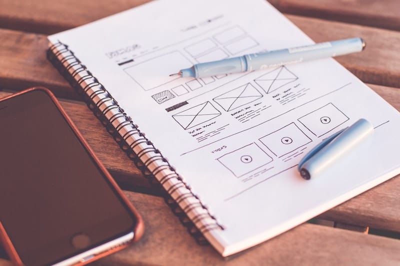
In this article, we will explore the User Experience principles behind Apple’s new Spatial Design operating system.
Table of Contents
Spatial Design: Designing for the User
To ensure a smooth user experience on the platform we are designing with this technique, it is crucial to strike a balance between innovation and familiarity.
Elements that users have always been familiar with, such as sidebars, tabs, and search fields, need to be designed in a way that allows users to navigate easily and find what they are looking for as if they have done it before.
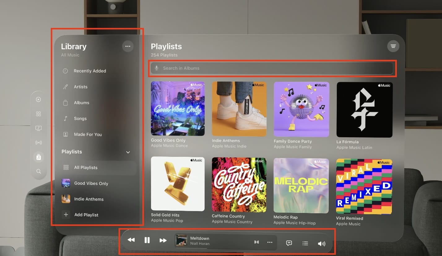
It is important to maintain recognizable and user-friendly interfaces that adapt to the spatial environment in question.
Spatial Design: Designing Windows
In the spatial operating system, windows take on a new visual language that enhances the user experience.
Among the key features, we find the Glass background that allows perceiving the space behind through transparency, giving the user the sensation of a floating window within a real space.
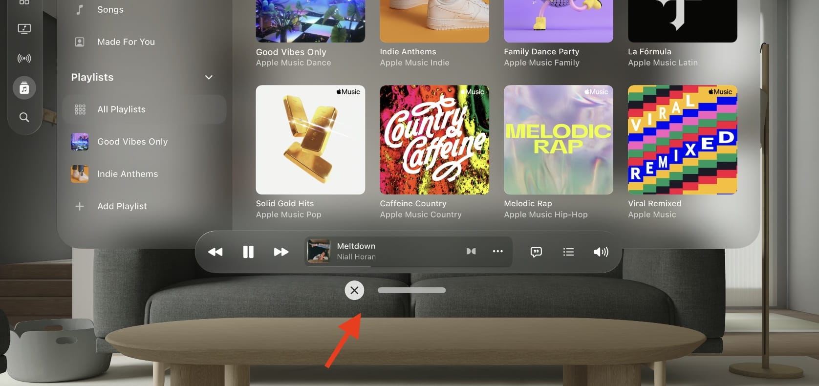
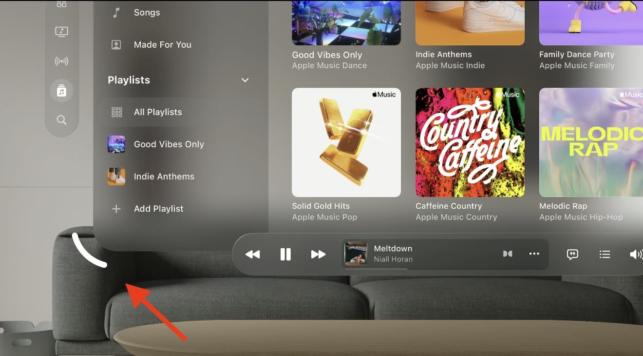
Furthermore, for window management, there are UI components that allow users to:
- Move,
- Close,
- Resize.
Spatial Design: Window Sizes and Scalability
The interaction created by this mix of elements and UI components makes the interface fluid and engaging.
Windows can adapt to different sizes, being highly flexible and scalable.
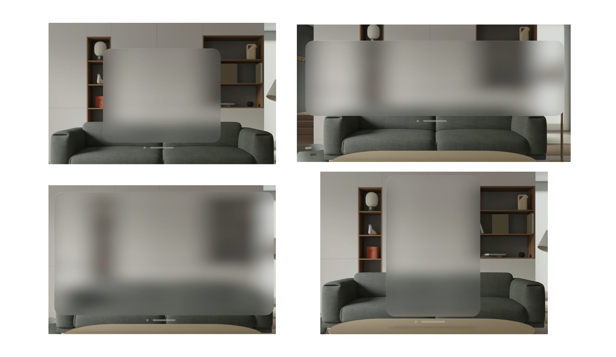
Users can choose the size they want and have full control over it.
However, UX designers should set standard sizes based on the content being viewed.
For example, a website on Safari should open in a vertically oriented window since users are accustomed to consuming web content vertically. A presentation on Keynote or Slides, on the other hand, should have a more horizontal format.
Spatial Design: Control Management in Windows
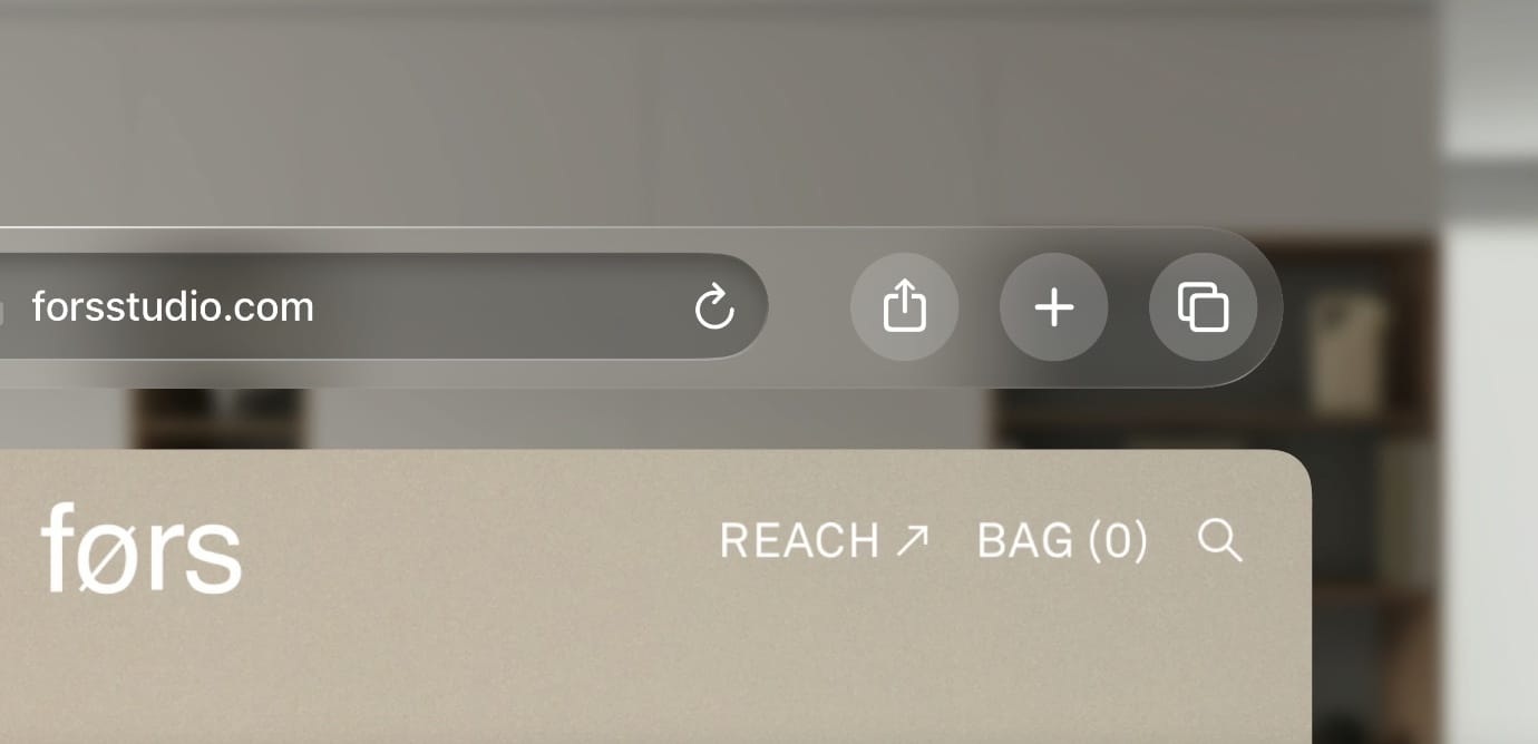
According to Apple’s Spatial Design techniques, window options and commands should be designed outside the window itself.
Spatial Design: Working with Points to Adapt Windows
Adapting interfaces to different screens is crucial in spatial design.
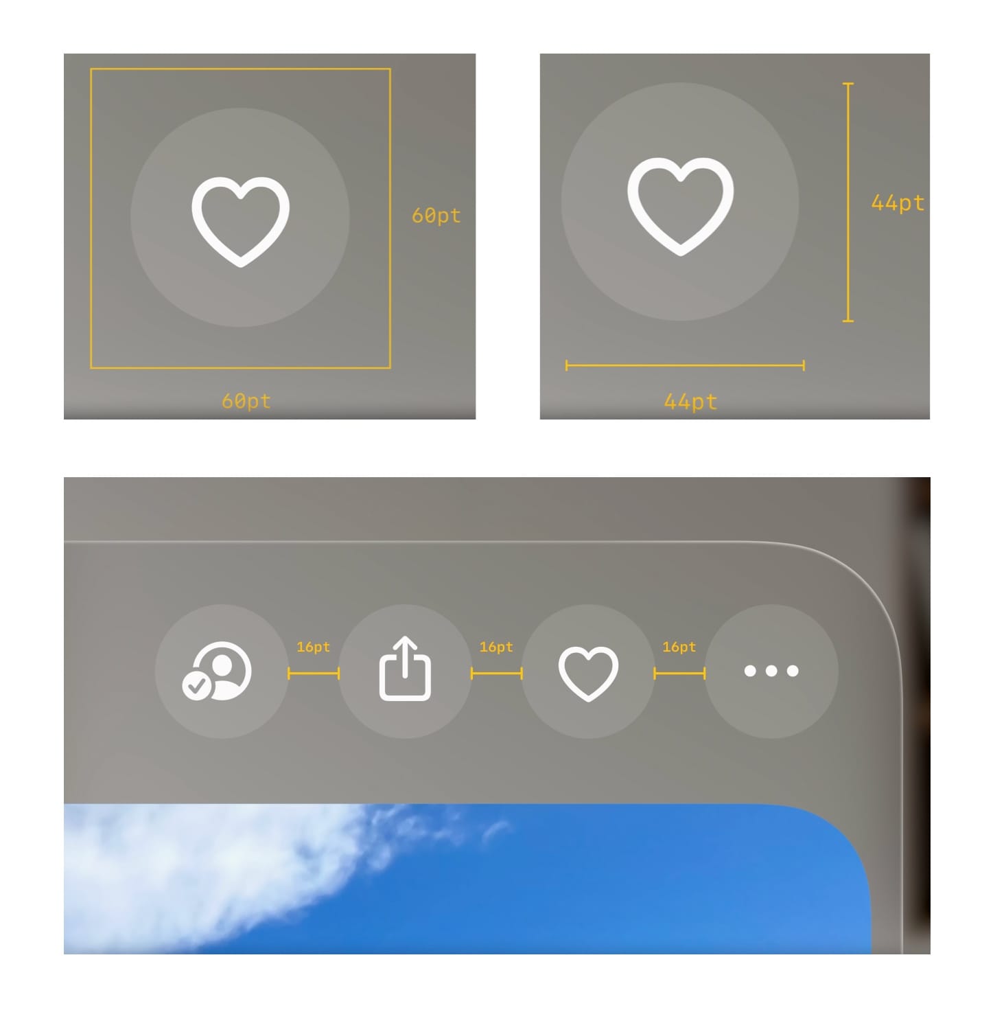
Apple has introduced the concept of points as a standard unit of measurement in design, allowing interface elements to adapt and scale based on user distance.
By designing with points, UX designers can ensure readability and usability at any distance, creating a consistent user experience.
Spatial Design: Perspectives, Ergonomics, and Movement
When designing apps based on Spatial Design User Experience, we must consider the following aspects related to the user:
- The surrounding environment
- Eye and hand interactions
- Ergonomics
Interfaces should be designed in a way that allows users to view content from various positions, whether lying down or sitting, for example.
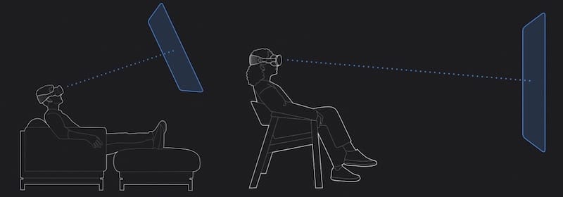
Considering basic ergonomic principles, interfaces should not be designed too close to the user or behind them.
A visual action field should be imagined within which nothing should be designed, and basic distances should be set during the design process.
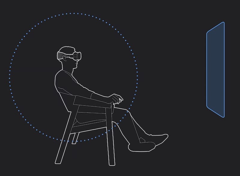
Apple’s guidelines also address minimal movements.
The Spatial Design guidelines recommend allowing minimal movements or even repositioning. Users may need to change rooms or move and turn towards another part of the room. In such cases, the central view can be reset by pressing a button on the viewer.
Spatial Design: Space, Depth, and Scale
Space Management: Guidelines
Regarding space management, Apple has studied the best method to make two types of environments coexist:
- Digital environments, such as websites, windows, music apps, and more
- Real environments, such as walls, chandeliers, sofas, chairs, etc.
While showing elements from real environments can provide a sense of connection to reality for users, it can also be distracting and prevent relaxation.
The solution is a hybrid one, considering two situations:
- Active user
- Passive user
For active interaction actions, such as moving a window or placing elements and micro-movements, transparency can be used to show both environments.
If we talk about active interaction actions, such as moving a window, placing elements, and micro-movements, then it is possible to create transparency to show both environments.
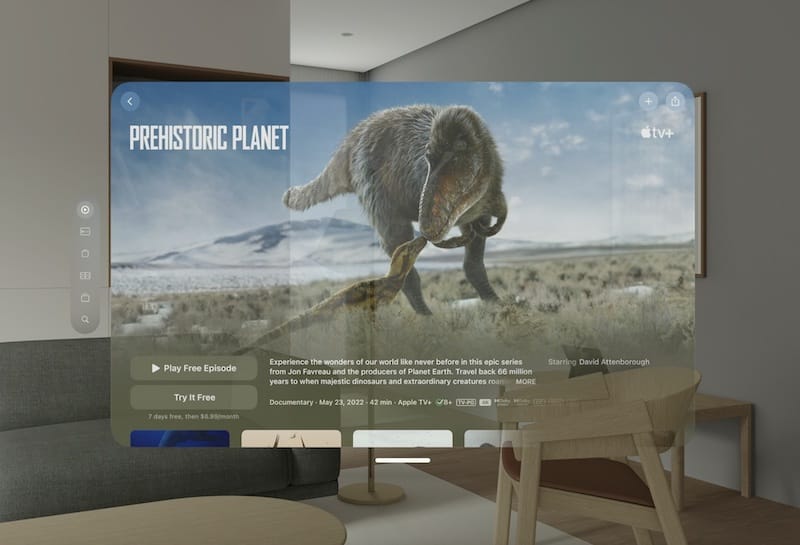
In this example, the user is dragging a window to the right.
Real elements, like the chair, are visible during this active action because the window while being moved, has transparency properties.
When the window is released and the desired video starts playing, the transparency will be completely eliminated, providing maximum immersion for the user.
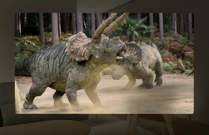
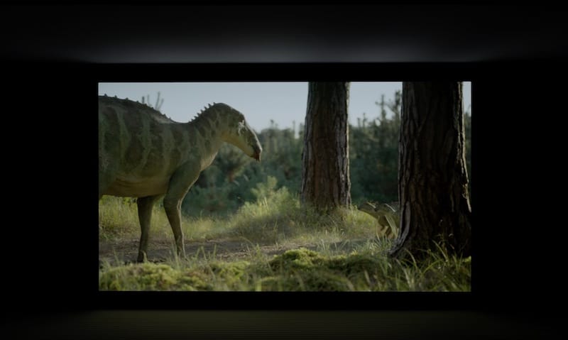
Now begins the passive interaction phase of the user, where the user relaxes and their actions are minimal or even nonexistent.
In this case, the guidelines on Spatial Design recommend allowing the user to choose their level of immersion using buttons on the headset.
In the image above, real elements in the background are still visible, while in the image below, they have been hidden, and the transition to total immersion has been made.
Depth Management: Guidelines
When designing user experiences in a surrounding spatial environment, it is necessary to use depth techniques to avoid creating a UI that is too large and cumbersome.
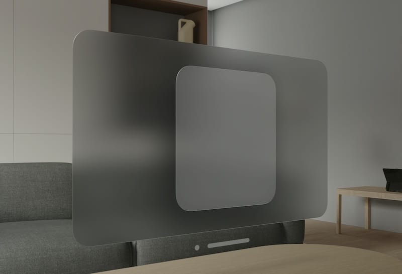
With this technique, it is possible to create a hierarchy and focus on content even in an environment far from the user’s eyes.
Depth significantly affects our perception of objects in space and should be designed effectively.
In this example, we can see that the video control element (where sound can be adjusted, paused, fast-forwarded, etc.) is positioned much closer to the user than the video itself, maintaining scale.
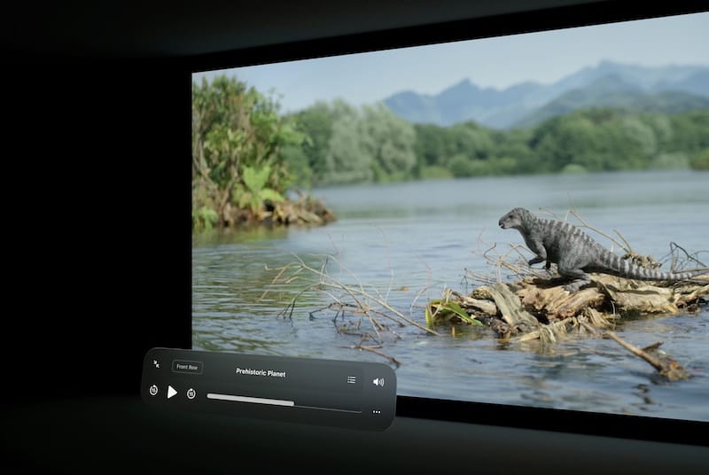
If it had been placed within the video, it would have been larger and less usable for the user.
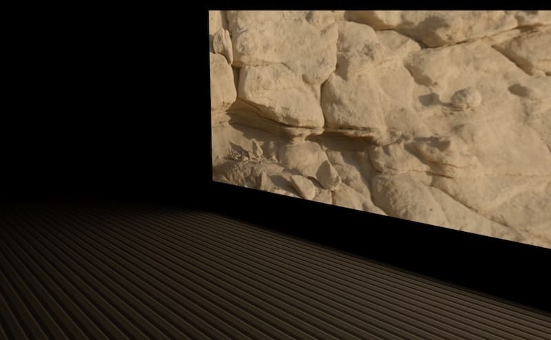
Another UI element that can be used to achieve depth is lighting and shadows. While watching a video, for example, you can see lights and shadows reflecting above and below to create a sense of depth that is pleasing to users.
Spatial Design: Immersiveness
Immersive experiences represent the pinnacle of spatial design.
Designing user experiences with Apple’s Spatial Design guidelines allows us to create apps that capture users’ attention while respecting the surrounding physical environment, from shared space windows to full-screen experiences.
This way, we can create digital experiences that blend with reality.
To ensure that users remain engaged, it is essential to guide their focus within immersive experiences.
Recommended techniques for directing attention include:
- movement,
- animations,
- spatial audio,
- and careful use of materials.
Spatial Design: Designing the UI
In this section, we will discuss UI Design according to Apple’s Spatial Design principles.
The developed visual language combines coherence with familiarity, adapting to immersive and spatial experiences.
There are five foundations:
- App icons
- Materials
- Typography
- Vibrancy
- Colors
Spatial Design UI: App icons
With Spatial Design, Apple has taken the concept of home screen icons to a more realistic and three-dimensional level.
When the user looks at a specific icon, the system emphasizes this effect by adding specular reflections and shadows, creating a sense of depth between layers.
![]()
App icons: Multiple Layers
For icons in Spatial Design, it is recommended to use multiple layers to achieve the 3D effect.
Each app icon can consist of up to three layers:
- a background
- and up to two front layers.
Design your layers as square images and remember to keep the graphics centered for optimal visual appeal.
![]()
The system will automatically apply circular cropping and render them in 3D.
It is also not recommended to use opacity and transparency on the layers.
![]()
Spatial Design UI: Glass Materials
When designing spatial interfaces, it is crucial to consider the materials used.
Apps should adapt to different lighting conditions and be easy to position and view in various environments.
Glass material is perfect for this use, as it is visually appealing and adaptable. It seamlessly blends with the physical world, allowing the surrounding environment’s light to interact with virtual content.
Even with dark effects, such as a dimly lit room at night, the effects of the glass material are optimal.
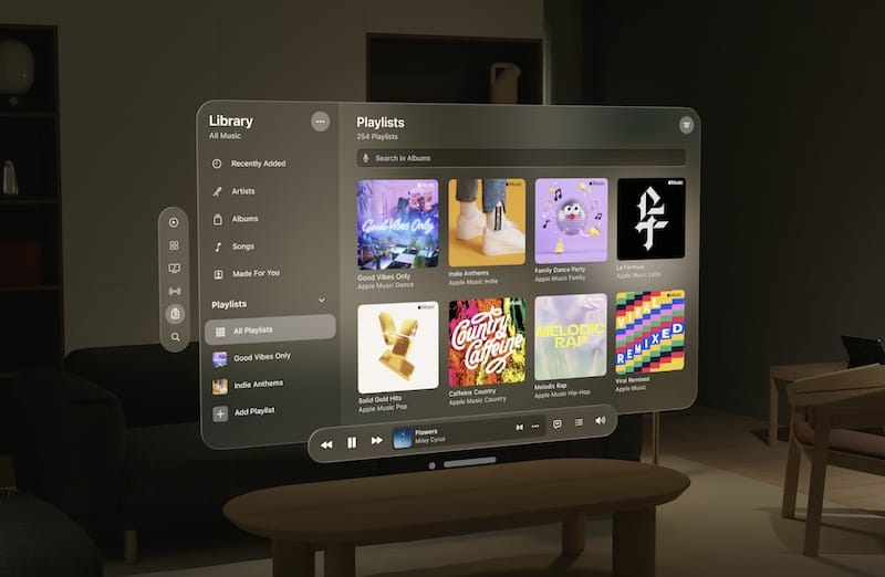
Using glass, you can create lightweight and visually engaging interfaces that provide a sense of depth and concreteness.
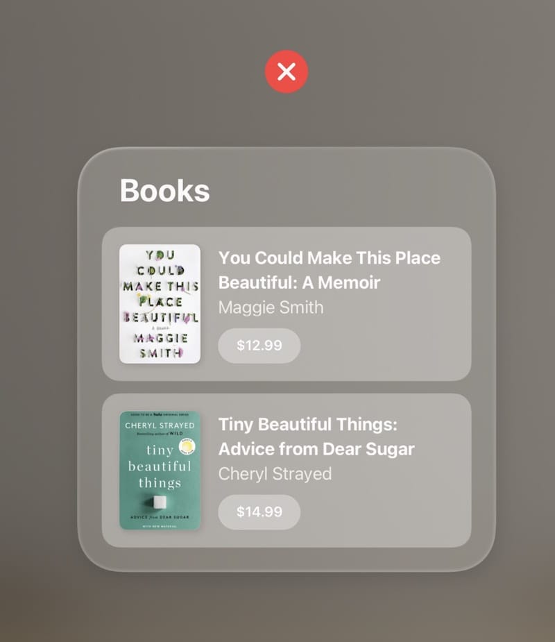
One guideline to consider is to alternate between light and dark layers.
For example, in this interface, it is correct to use a dark layer on top of a light one to highlight the element and visually work like in Card Design.

Unaltered effects, such as placing a light layer on another light one, do not work well with contrasts and have issues with visual accessibility.
Spatial Design UI: Typography
As we have seen in our Visual and UI Design Course, text plays a vital role in interfaces and should be accessible, readable, and adaptable to different situations.
The same principles apply to Spatial Design, but the design technique suggests slightly increasing the thickness.
While in iOS, it was recommended to use “regular” font type for body elements and “semibold” for titles, in Spatial Design, it is advised to increase the thickness:
- Body with medium font;
- Titles with bold font.
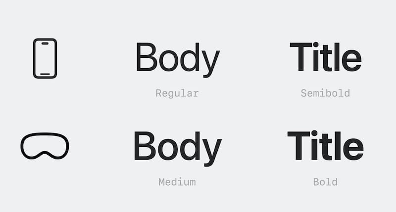
Additionally, to improve readability, the tracking has been increased, and new character styles optimized for wide editorial-style layouts have been introduced.
Spatial Design UI: Vibrancy
Vibrancy is another essential aspect to maintain readability.
With this technique, we can illuminate foreground content and dynamically adapt to background changes, ensuring that the text remains clear and readable.
Apple uses different levels of Vibrancy: Primary, Secondary, Tertiary, etc.

Spatial Design UI: Colors
The use of colors should also be taken into consideration.
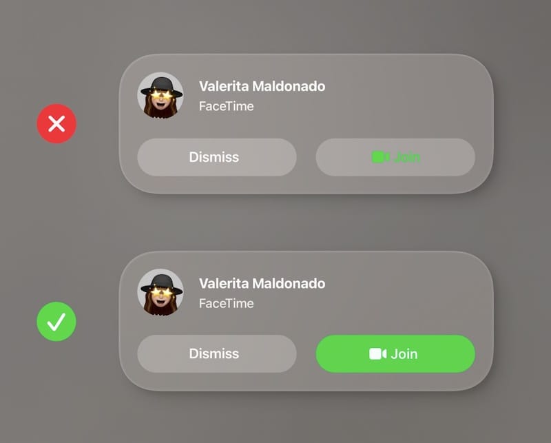
All web accessibility rules still apply, but with Spatial Design, we need to be cautious about contrasts, especially when working with a non-flat background like glass.
If we want to use colors, it is recommended to apply them to an entire element, not just the text. Otherwise, white text and icons are highly recommended.
Spatial Design: Layout
To create ergonomic layouts in Spatial Design, it is essential to consider user comfort and safety.
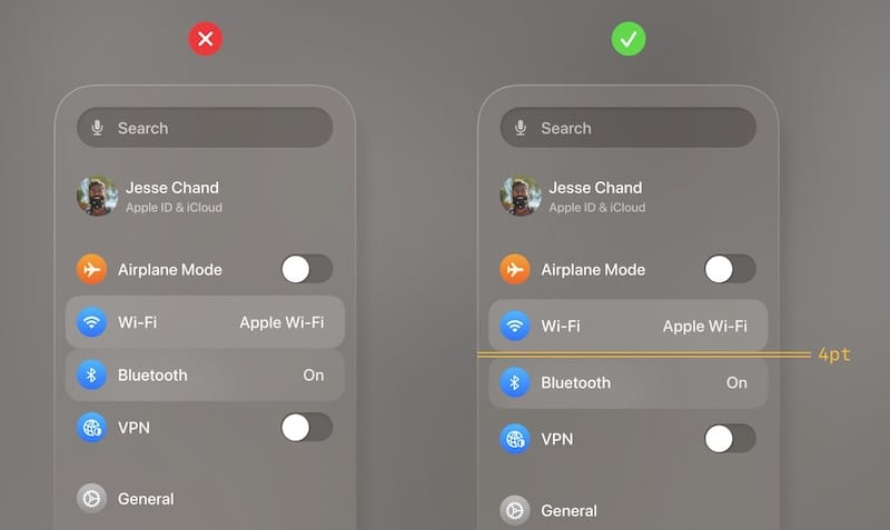
To achieve this goal, we can certainly keep in mind the rules we’ve seen earlier about window design, and icon spacing, and also consider the user’s field of view, eye, and neck movement, aiming to position the content within their field of view during the design phase.
Spatial Design guidelines prefer wider elements and centered information.
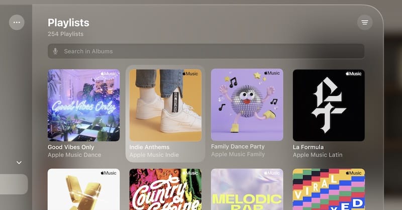
Regarding interactive element targeting, ensure they have a selection area of at least 60 points of space. Even visually smaller elements can meet this requirement by adding sufficient space around them.
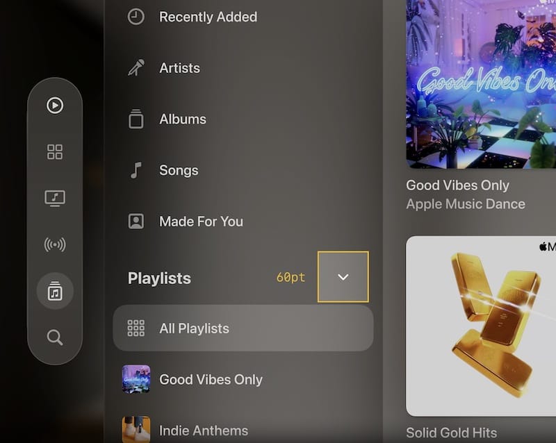
Lastly, leverage visual focus to indicate the interactivity of UI components and consider padding for hover effects.
Spatial Design: Input
In spatial interfaces, people interact using their eyes, hands, and voice.
It is also possible to create keyboards within the “space” and use fingers to type as if it were real.
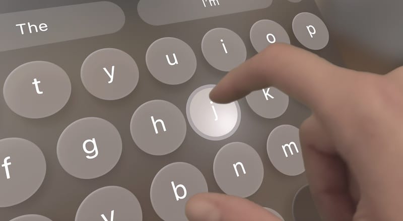
Of course, it is also possible to connect Bluetooth keyboards or trackpads and write and interact normally.
Understanding input patterns is crucial for designing intuitive experiences.
By using system components, you can quickly create interfaces that respond smoothly to user actions.
As for ornaments, such as navigation elements or options, it is advisable to use a simple design without borders or backgrounds, as the effects are added when they are framed by the user’s eyes or selected.
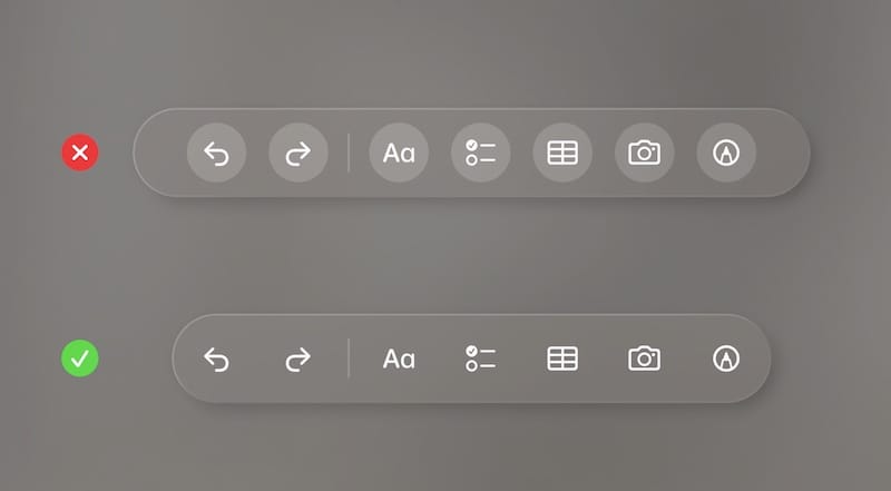
For larger window-like elements, these ornaments should be displayed at the edges of the window (bottom, sides, or top, for example).
In this example of a “player” bar, it is recommended to position it 20 points above the main window being controlled.
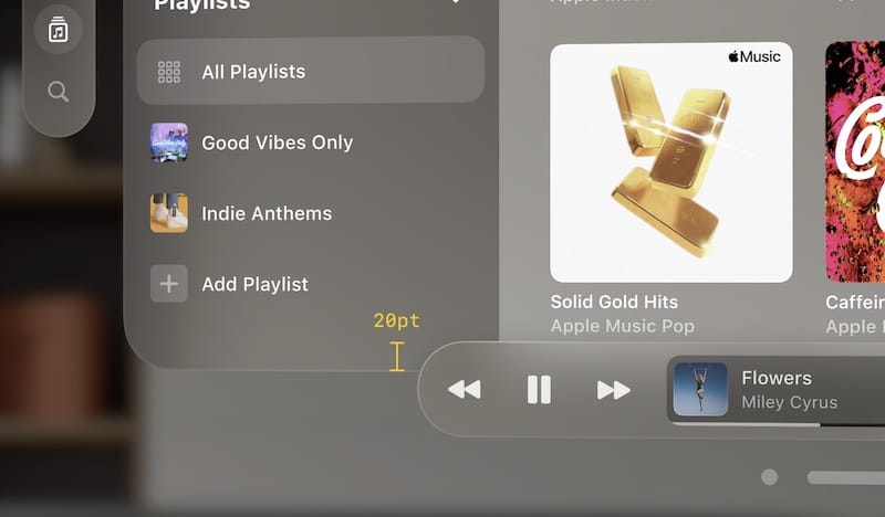
Becoming familiar with components like windows, tab bars, and sidebars helps us design user experiences and optimize content organization.
Spatial Design: Eyes and Hands
Spatial Design introduces new ways of interacting with user interfaces (UI),
leveraging eyes and hands. With spatial design, users can easily control their devices by both looking at UI elements and using hand gestures. This enables a more personal, comfortable, and precise user experience.
Designing for Eyes
Eyes play a fundamental role in spatial experiences, serving as the primary targeting mechanism. To ensure comfortable interactions, it is crucial to position UI content within the user’s field of view, with attention to the center.
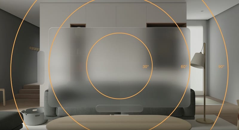
Peripheral areas can be reserved for less frequently used content, such as secondary actions while keeping the main content easily accessible and centered.
Depth in spatial design should also be considered. Maintaining interactive content at a consistent depth allows effortless transitions between UI elements. By using subtle depth changes, designers can effectively communicate hierarchy while reducing eye strain.
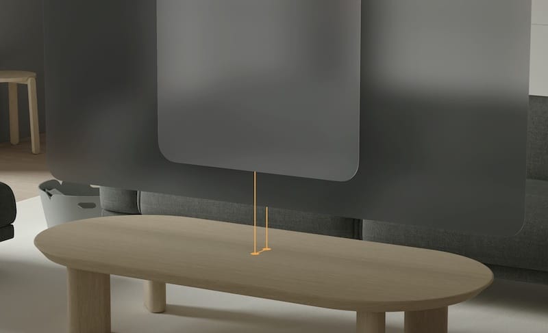
To optimize eye targeting, designers can leverage round shapes, such as circles and rounded rectangles, which naturally guide attention to the center.

Furthermore, ample spacing between elements and text enhances eye precision and usability.
As mentioned earlier, maintaining a minimum target area of 60 points for eye-based interactions is crucial. The standard components provided by the system facilitate easy targeting, but when designing custom elements, it is crucial to adhere to size guidelines.
Eye interactions can be enhanced through subtle hover effects, indicating that the user’s gaze is driving the interaction. Hover effects should be discreet and harmonize with the content, adding responsiveness to UI elements.
Designing for Hands
Hands are another powerful method of interacting with spatial input.
Hand gestures enable intuitive control, which can be leveraged to offer an engaging and fluid user experience.
Hand gestures should be intuitive and natural. Recognizing common gestures, such as pinch-to-zoom or drag-to-move, allows users to feel comfortable and quickly learn the interactions.
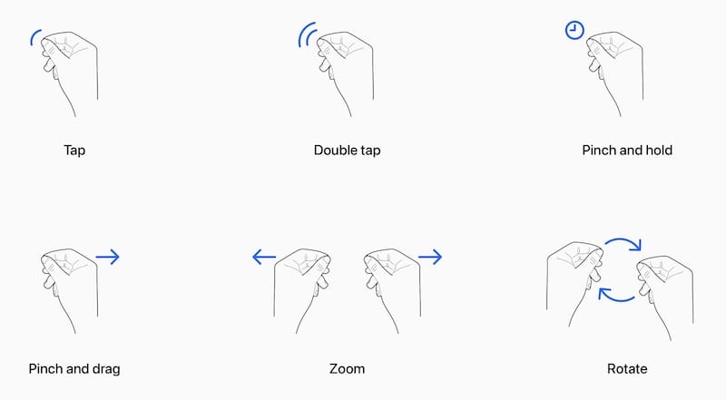
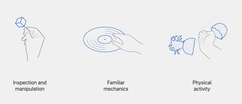
Component sizes and spacing must be designed considering the size of users’ hands. Elements that are too small can be frustrating to touch, while elements that are too large can make it difficult to reach specific parts of the UI.
Testing and iteration are crucial to determine the optimal element sizes.
One of the most exciting experiences of Spatial Design is the combination of eye-hand interaction. For example, on this screen, the user can look at a specific point in an image within a window and use their hands to zoom in only on the framed area.
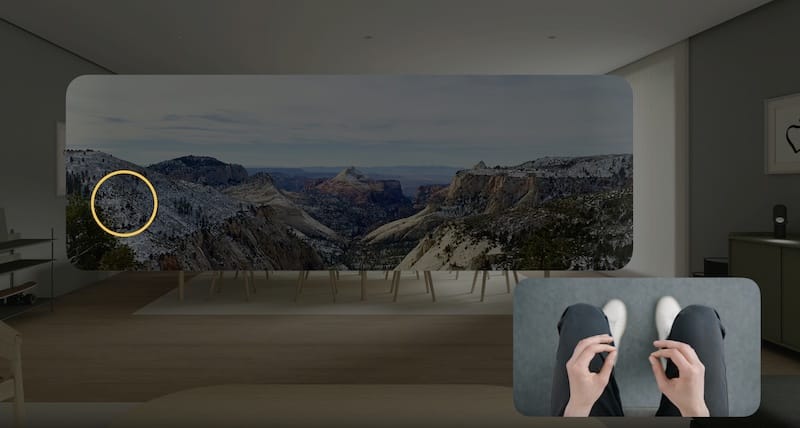
Credits: Apple Developers
Become UX Designer and work on Spatial Design Experiences
In order to become UX Designer you will have many options, one of the best is attending an online course combining theory with practice with the help of a mentor.
Our UX/UI Design courses are 100% online and on-demand, with no extra costs, so you can independently manage your study hours according to your commitments.
At the end of the course, if you have completed and passed all the practice tests, you will receive a UX certificate attesting to your skills.

