The usability heuristics formulated by Jakob Nielsen in 1994 are still, thirty years later, the common language of UX Design. Every designer in the world knows them, uses them to evaluate interfaces, teaches them to beginners. They aren't rigid rules: they're general principles that help you spot usability problems even before running tests with real users.
This article walks through the 10 heuristics clearly, with concrete 2026 examples and a practical checklist for your next heuristic evaluation. The point isn't to memorize them — it's to internalize them to the point where you recognize violations on sight, the way a musician hears a wrong note.
What you'll learn:
- What Nielsen's heuristics are and how they came to be
- Each of the 10 heuristics with real-world examples of violations and compliance
- How to run a heuristic evaluation in 4 steps
- A practical checklist for your next review
- The limits of the method (what heuristic evaluation doesn't catch)
What usability heuristics are
Heuristics are general design principles — not specific rules — that capture the characteristics of a usable interface. Jakob Nielsen, co-founder of the Nielsen Norman Group, formulated them based on an analysis of hundreds of real usability problems collected in 1990s studies.
Their strength is their generality: they don't tell you "put the login button in the top right," they say "speak the user's language," "give immediate feedback," "be consistent." They apply to any digital interface, from 2026 mobile apps to airport terminals.
Heuristics are used in two main ways:
- As design guidance: while you're designing, you ask yourself "am I honoring the 10 heuristics?"
- As an evaluation method: once designed, you inspect the interface to find violations (heuristic evaluation)
Nielsen's 10 heuristics
1. Visibility of system status
Principle: the interface should always let users know what's going on, through timely and appropriate feedback.
Violation example: you click "submit" and for 4 seconds nothing happens. You think it's broken, you click again, and again. The action ends up being submitted three times.
Compliance example: as soon as you click "submit," the button shows a spinner and goes disabled. After 2 seconds a success message appears. You know exactly what's happening.
This is perhaps the most frequently violated heuristic of all. Visual feedback is cheap to implement and its absence destroys the perceived reliability of the product.
2. Match between system and the real world
Principle: the system should speak the user's language, using words, phrases, and concepts familiar to them instead of internal technical jargon.
Violation example: an error in a banking app reads "Error code 0x800CCC0E: SMTP authentication failure." The user has no idea what that means.
Compliance example: same situation, but the message says "We can't send the transfer right now. Try again in a few minutes or contact our support."
Translating technical language into human language is ongoing UX writing work. It's worth it because it's one of the things users notice (or fail to notice) the most.
3. User control and freedom
Principle: users make mistakes. The interface must let them undo actions, go back, and change their choices without getting stuck.
Violation example: a 10-step signup form with no "back" button. If you make a mistake at step 8, you have to redo steps 1 through 7.
Compliance example: Gmail lets you undo sending an email for 30 seconds after you click "send." A small change with a huge impact on user trust.
4. Consistency and standards
Principle: similar things should behave similarly across the product. Don't make users wonder whether different words or actions mean the same thing.
Violation example: in the same app some "confirm" buttons are green and others are blue. Some destructive actions say "delete," others "remove," others "erase."
Compliance example: an internal design system that defines each component (buttons, links, inputs) with clear states and variants. The same type of action is always presented the same way.
Heuristic 4 is why design systems exist. Once a product scales, consistency only survives with systematic tooling.
5. Error prevention
Principle: better than a good error message is a design that prevents the error from happening in the first place.
Violation example: a form that accepts any input and then, after submission, tells you the date was in the wrong format.
Compliance example: a date picker that physically prevents you from selecting invalid dates. The error simply can't occur.
Error prevention requires thinking ahead about "what could go wrong," a mindset that the best designers develop with experience.
6. Recognition rather than recall
Principle: minimize the user's memory load by making options, actions, and objects visible. Users shouldn't have to remember information from one part of the interface to another.
Violation example: a command-line interface where you must remember the exact commands.
Compliance example: a visible menu showing all available options. Autocomplete that surfaces suggestions as you type. An easily accessible recent history.
This principle ties directly to Hick's law and the limited capacity of working memory.
7. Flexibility and efficiency of use
Principle: accelerators for experts without sacrificing accessibility for beginners. Let users customize frequent actions.
Violation example: an app that forces expert users to follow the same long flow every time, with no shortcuts.
Compliance example: desktop applications that support both a visible menu (for beginners) and keyboard shortcuts (for experts). Figma, Notion, and VS Code are canonical examples.
8. Aesthetic and minimalist design
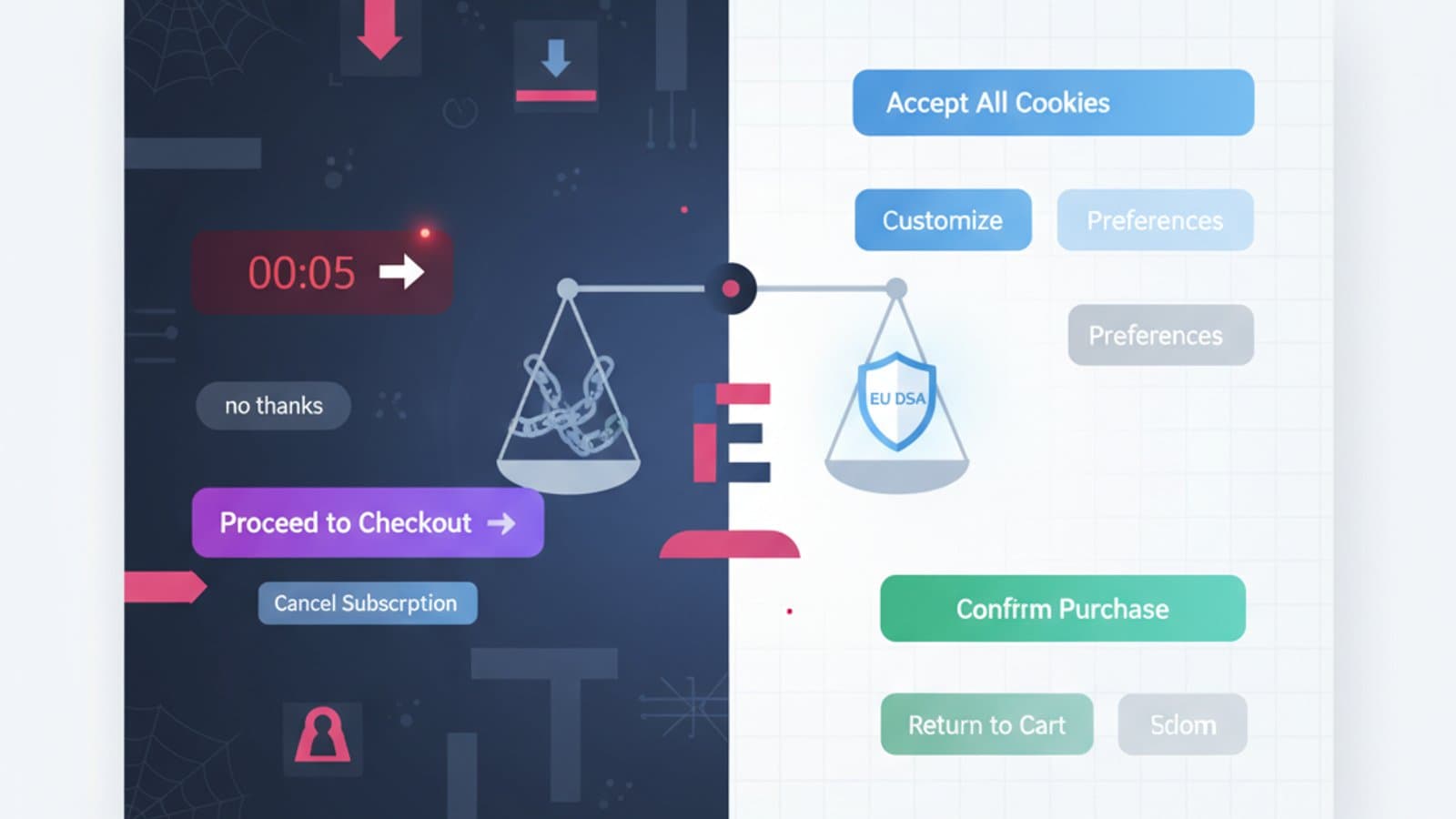
Principle: interfaces shouldn't contain information that is irrelevant or rarely needed. Every extra unit of information competes with the relevant ones for the user's attention.
Violation example: a homepage with 30 different sections stuffed with banners, popups, cookie bar, chat widget, newsletter signup, notification badges, trust badges. The user has no idea where to look.
Compliance example: Stripe's or Linear's homepage: 2–3 elements per view, clear visual hierarchy, generous white space.
Important note: "minimalist" doesn't mean "a few colored pixels." It means relevant. A dense enterprise interface packed with useful information is more "minimalist" — in the heuristic's sense — than an empty page with 3 decorative elements.
9. Help users recognize, diagnose, and recover from errors
Principle: when errors happen (and they will), error messages must be clear, non-technical, and suggest a concrete solution.
Formula for a perfect error: What happened + why + what you can do.
- ❌ "System error"
- ❌ "Required field"
- ✅ "That ZIP code isn't valid. It should be 5 digits — you entered 4."
- ✅ "We can't reach the server. Check your internet connection and try again."
10. Help and documentation
Principle: ideally, the interface should be usable without documentation. When documentation is necessary, it should be easy to search, focused on the user's task, and concise.
Compliance example: a contextual help section that appears when it's needed, with a link to the full resource for those who want to dig deeper. Tooltips on non-obvious elements. Guided onboarding only the first time.
Violation example: a 200-page PDF manual shipped with an enterprise software product because "it's all written in there anyway."
How to run a heuristic evaluation
Heuristic evaluation is the cheapest and fastest usability evaluation method in existence. It doesn't replace usability testing with real users, but it complements it: it finds many problems in a few hours, without having to recruit anyone.
Step 1: prepare
- Define the scope: which screens or flows will you evaluate? Don't try to assess everything at once.
- Pick the evaluators: ideally 3–5 independent experts. One evaluator finds about 35% of the problems; five find roughly 80% according to Nielsen's classic data.
- Define usage scenarios: don't evaluate "cold" — use 2–3 concrete scenarios ("a new user signing up," "a returning user completing an order").
Step 2: evaluate
Each expert, working alone, walks through the interface on the predefined tasks and notes every problem they see, classifying it by:
- Heuristic violated (which of the 10)
- Severity (1=minor, 4=catastrophic — Nielsen's scale)
- Exact location (screenshot + annotation)
- Problem description
- Suggested fix
Step 3: consolidate
After the individual evaluations, the evaluators meet to consolidate findings, remove duplicates, and agree on a single shared list.
Step 4: prioritize and communicate
The final list goes to the product team sorted by severity. Critical issues (severity 3–4) should be fixed before the next release; minor ones (1–2) go into the backlog.
Practical checklist for your next heuristic evaluation
Printable on a single page:
- Is feedback after each action clear and immediate? (H1)
- Is the language understandable to a non-technical user? (H2)
- Can the user undo or go back from any point? (H3)
- Are elements and patterns consistent across the product? (H4)
- Are the most likely errors prevented by design? (H5)
- Can the user see the available options without having to remember them? (H6)
- Are there shortcuts for expert users? (H7)
- Is every visible element relevant to the task? (H8)
- Are error messages clear and do they propose solutions? (H9)
- Is help accessible and contextual where it's needed? (H10)
Limits of heuristic evaluation
It's a powerful method but not omnipotent. Three things it doesn't capture:
- Domain-specific problems: if you're evaluating medical software, a generalist evaluator doesn't know that a particular workflow is clinically important for the physician.
- Real user behavior: evaluation predicts what might happen; it doesn't measure what actually happens. For real behavior you need usability testing and A/B testing.
- Emotional and motivational problems: "the interface is functionally perfect but feels cold to me" — that doesn't come out of an evaluation.
For these reasons heuristic evaluation is the first step, not the only one. Combined with qualitative usability tests and quantitative analytics, it covers the full picture.
Frequently asked questions
How many heuristics are there?
Nielsen's 10 are the most famous, but they're not the only ones. Bruce Tognazzini has 16 interaction design principles, Bill Scott proposes different variations, NN/g itself has extensions specific to mobile and VR. To get started, know Nielsen's 10 thoroughly — the rest is incremental.
How long does a heuristic evaluation take?
For an average product: 4–8 hours per individual evaluator. With 3–5 evaluators plus consolidation: 1–2 weeks total including the final report. It's far faster and cheaper than a full usability test with real users.
Can a junior run a heuristic evaluation?
Yes, and they should. It's one of the most effective training exercises in UX Design: it forces you to look systematically, name problems, and propose solutions. A junior will do it with less depth than a senior but still usefully.
Does heuristic evaluation work for mobile apps?
Yes, with the addition of mobile usability principles (touch targets, thumb-reachable zones, usage contexts). The 10 classic heuristics stay valid but need to be supplemented with mobile-specific considerations.
Are heuristics still relevant in 2026?
Yes. Technologies change, human cognitive principles don't. Nielsen's heuristics remain among the most enduring contributions of the UX discipline, and they apply to conversational interfaces, VR, AR, and voice UI — with adaptations.
Next steps
Heuristics are one of the most versatile tools in a designer's drawer. To keep going:
- Study the mobile usability principles for the specific mobile context
- Dig into the psychology of Gestalt that underlies many heuristics
- Learn user research to combine evaluation with real-user testing
CorsoUX's Interaction Design course includes hands-on heuristic evaluation exercises with mentor feedback, and teaches you how to integrate the method with usability testing and quantitative analysis.