How many times have you closed a page in front of a 40-item menu instead of picking something? Hick's law puts a number on that feeling: the more options you give a user, the more time they need to decide, and beyond a certain threshold the decision simply doesn't happen.
It's one of the most cited principles in interaction design because it connects cognitive psychology to a concrete choice every designer faces a thousand times: how many options should I put in this menu, this dashboard, this list? Designers who know Hick's law have a better answer.
What you'll learn:
- The Hick formula and what it really means
- Why "too many options" is a cognitive-load problem, not an aesthetic one
- How Amazon, Apple, and IKEA apply it every day
- 6 practical rules for reducing choice time
- The limits and exceptions of Hick's law
- How to measure it in your user tests
Hick's law: what it is and how to calculate it
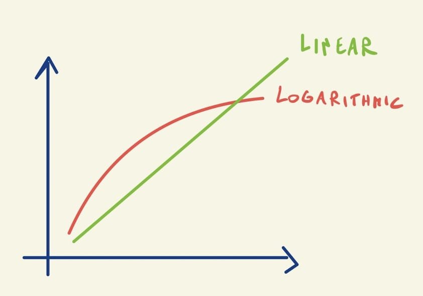
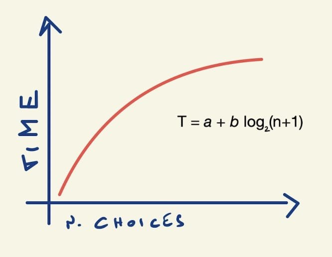
Hick's law — or more precisely the Hick–Hyman law — states that the time required to make a decision grows logarithmically with the number of available alternatives. It was formalized in 1952 by British psychologists William Edmund Hick and Ray Hyman in a series of reaction-time experiments, and it remains a key reference in Jon Yablonski's Laws of UX.
The simplified formula is:
RT = a + b × log₂(n + 1)
Where RT is reaction time, n is the number of alternatives, and a and b are constants tied to the individual and the context. You don't need to remember the formula — you need to remember the curve.
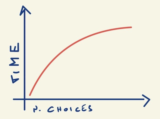
Decision time grows rapidly from 2 to ~7-8 alternatives, then flattens. But the point that often gets forgotten is the second one: beyond a certain threshold users stop comparing. They don't decide better with 50 options than with 20 — they decide worse, or they don't decide at all.
The real problem is cognitive load
Hick's law isn't just about time. It's about mental effort. Every option added to an interface consumes a small amount of the user's working memory, which is notoriously limited. In his famous paper "The Magical Number Seven, Plus or Minus Two", psychologist George Miller estimated that we can actively manipulate about 7 elements at a time.
The conflict is obvious: a menu with 30 items isn't a pixel problem, it's a neurology problem. The user can't "see them all" — they scan a handful, give up, go back, or fall back to a shortcut (click the first one, or use the search bar).
As a designer you can pull three levers to reduce the cognitive load of a choice.
1. Reduce the absolute number of visible options
The most direct and most effective lever. Always ask yourself: which options need to be visible right away, which can hide behind an interaction, which can disappear entirely? The most-used 20% should occupy 80% of the space; the rest can live in a "More" section, in search, or in a secondary menu.
2. Leverage familiarity
Users process information faster when they recognize it. If your menu uses the same labels the user saw yesterday on another site, decision time drops sharply. That's why you don't invent new names for known concepts: "Cart" beats "Shopping backpack," "Profile" beats "My area."
3. Group options
Seven chunks of 5 items are much easier to process than 35 scattered items. Visual hierarchy — spacing, sections, dividers, labeled groups — turns a flat list into a navigable structure. It's the same logic our brain uses when it memorizes a phone number in groups of digits rather than as a single string.
Real examples: who applies Hick's law (and who doesn't)
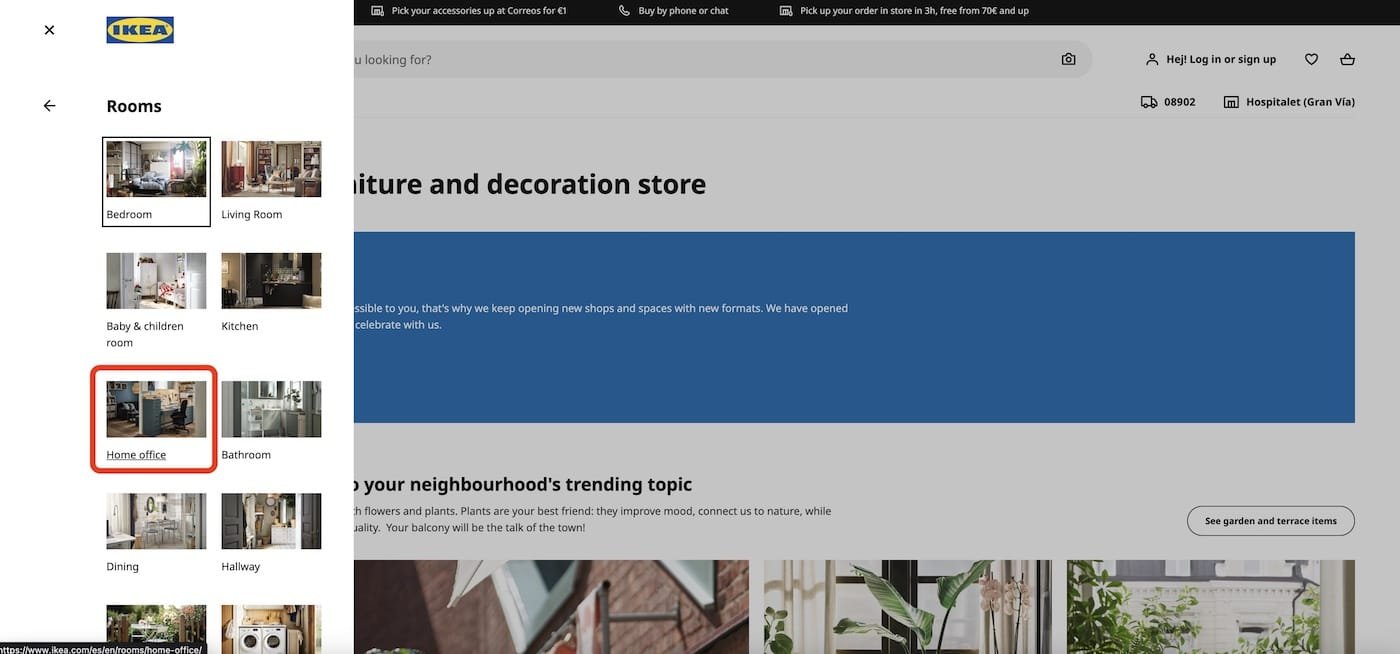
IKEA: categories instead of catalogs
IKEA sells thousands of products. Instead of listing them flat, the homepage offers 8-10 macro categories (living room, kitchen, bedroom…) that act as entry doors. Each category then branches further. The user never decides among 10,000 products: they decide among 10, then among 10, then among 10. Three choices of 10 are far faster than one choice of 1,000.
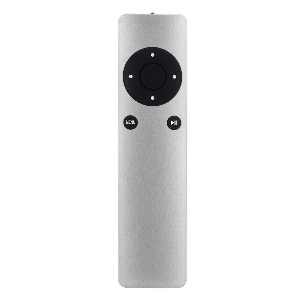
Apple: the minimal remote
The original Apple TV remote has 6 buttons. A typical cable TV remote has 52. Run a usability test with both and the result is predictable: first-time users succeed with the Apple one on their first try.

It's not a question of age: it's Hick's law at work. Apple cut everything that wasn't essential. Hidden functions are accessible via gestures or long-presses — present but not competing with the primary ones.
Amazon: when Hick's law seems broken
Amazon is an interesting paradox. The homepage is packed with deals, carousels, recommendations, 20 categories in the left-hand menu. It looks like a flagrant violation of Hick's law. Why does it work?
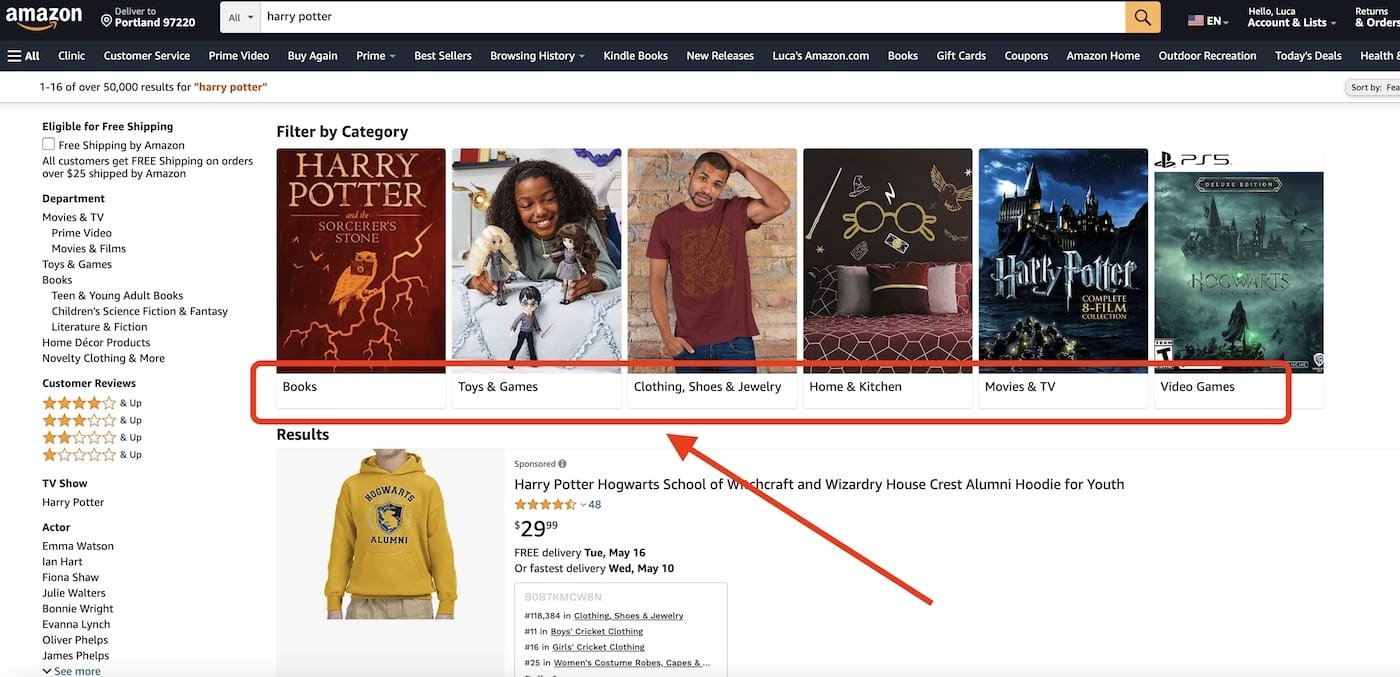
Because Amazon doesn't ask users to pick among all options at once. The search bar is the real entry point for people who know what they want; the recommendations are guided paths for those who don't. The interface is dense but layered: each user only sees their own path, not the full set. Hick's law isn't violated, it's bypassed by offering alternatives to explicit choice.
That's an important lesson: the fix for "too many options" isn't always "fewer options." Sometimes it's a different path to reach the decision.
6 practical design guidelines
Applying Hick's law means making concrete choices every day. Here are the 6 rules we use and teach.
1. Limit primary options to 5-7
For primary navigation menus, tabs, CTAs above the fold, toolbar actions: stay under 7 items. If you have more, some of them aren't really "primary."
2. Use progressive disclosure
Show only the essentials up front, reveal the rest when the user asks for it. A form that hides advanced fields behind a "Show advanced options" toggle is a canonical example.
3. Organize with meaningful categories
If you have 30 items, group them into 4-6 categories of 5-8 items each. Test the category labels with a card sort — the most reliable method for discovering how your users group things in their heads.
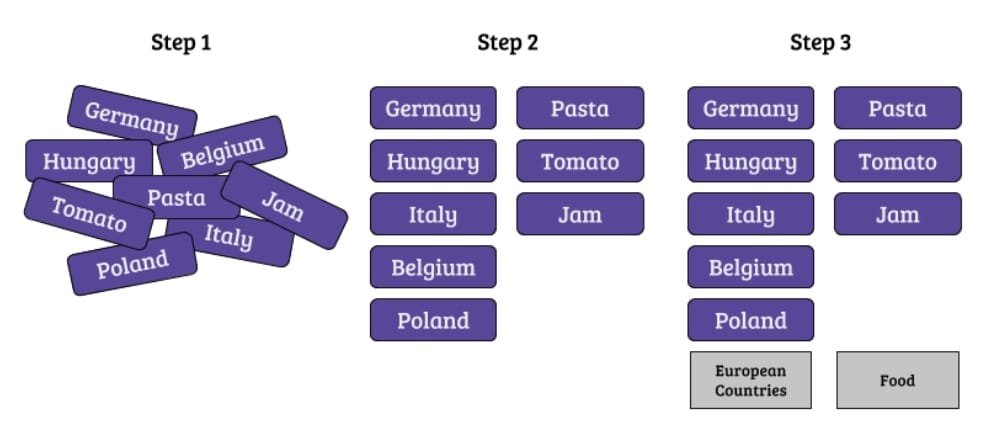
Card sorting in 4 steps
Card sorting is the go-to technique for defining a navigable structure that respects Hick's law:
- Prepare a set of cards (physical or digital) with the items to organize
- Ask 10-15 users to group them in the way that makes most sense to them
- Analyze common patterns: which cards always end up together? What do people name the groups?
- Build the final structure based on the results, not on your intuition
Tools like Optimal Workshop or Maze let you run card sorts online with hundreds of participants.
4. Offer a reasonable default
When you have to ask for a choice, start with a sensible preselected option. The user should always be able to change it, but in most cases they'll accept the default — which collapses decision time to zero. It's the principle behind "design nudges" in behavioral science.
5. Use visual elements to speed up recognition
Icons, colors, thumbnails, and previews reduce scanning time because the brain processes images faster than text. A file menu with icons for the file types (pdf, docx, jpg) is faster to scan than a textual list.
6. Avoid the choice when possible
The fastest choice is the one that doesn't exist. Before asking the user to decide, ask yourself: do I really need to ask? Can you infer the answer from data? Can you use a good default with a way to change it later? Can you merge two options into one?
The limits of Hick's law
Like every UX "law," Hick's is a heuristic, not a universal truth. Three important limits to keep in mind:
- It doesn't apply when the user is exploring. In a film catalog or a content feed, too few options reduce engagement. Netflix deliberately shows lots of titles because it wants to invite discovery, not fast decisions.
- It doesn't account for familiarity. An Excel expert doesn't suffer from Hick's law looking at a ribbon with 100 commands, because they've already memorized where things are. The law weighs heavily on new users, much less on recurring ones.
- It doesn't distinguish the quality of the choice. Reducing to 3 all-wrong options is worse than having 10 of which 2 are right. Hick's law should be applied after figuring out which options are actually useful.
Nielsen Norman Group, in "Hick's Law: Making the Choice Easier for Users", reminds us that the problem is never "how many options" in the abstract, but "how many options competing for the same user goal."
How to measure Hick's law in your user tests
If you want to validate that a simplification actually worked, measure it. The three key metrics:
- Time on task: how long does the user take to complete the task? Hick's law predicts a logarithmic drop, so reducing from 20 to 10 options doesn't cut time in half — it reduces it by about a third.
- Task success rate: how many complete the task without errors? Fewer options = less ambiguity = more success.
- SEQ (Single Ease Question): after the task, ask "How easy was this task?" on a 1-7 scale. It's a subjective measure but strongly correlated with satisfaction.
A typical study: 8-12 participants, version A (current interface) vs version B (simplified interface), same task, comparing the three metrics. If B improves on all three, the simplification worked.
Frequently asked questions
What's the difference between Hick's law and Miller's law?
Hick's law deals with decision time as a function of the number of options. Miller's law deals with working memory capacity (about 7±2 chunks). They're complementary: Miller explains why users get lost above a certain threshold, Hick measures how much they slow down below it.
Can I use Hick's law in forms?
Yes, carefully. Reducing the number of fields in a form drastically cuts drop-off — it's the same dynamic. The Baymard Institute measured that optimal e-commerce checkouts average 8 fields, compared to a median of 11. Every field removed is one less decision.
Does Hick's law apply to voice and conversational interfaces?
It applies even more. Options read out by Alexa or Siri are far more cognitively expensive than those seen on a screen, because users have to memorize them as they listen. The practical rule: no more than 3-4 options at a time in a voice UI.
Doesn't reducing options make the interface dull?
Simplicity and poverty aren't the same thing. Applying Hick's law doesn't mean stripping out features: it means ranking them. Rare features stay accessible, they just don't compete with the daily ones. It's the Pareto principle applied to UIs.
Is there a magic number of options not to exceed?
No, it depends on context. Common guidelines: 5-7 for primary menus, 3-5 for CTAs, 8-10 for filter categories, 15-20 for dropdowns with search. These are starting points to validate with user testing, not fixed rules.
Conclusion: choose less, decide better
Hick's law is one of those ideas that, once internalized, changes how you look at every interface. It's not about aesthetic minimalism: it's about respect for the time and cognitive energy of the people using your product.
Every time you add an option, you're charging the user a small toll. Make sure it's worth it.
If you want to dive deeper into how these laws combine in design practice, CorsoUX's Interaction Design course dedicates a full module to cognitive load, the psychology of Gestalt, and the other principles that guide the design of truly usable interfaces.