This article was published first on LogRocket.
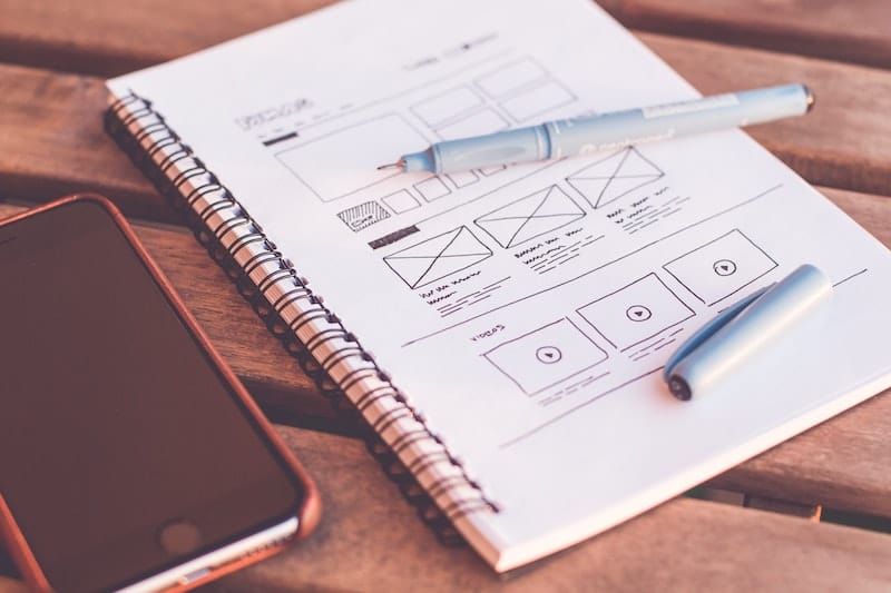
User experience design is crucial for the success of any digital product or service.
Analytics for UX designers is very important, and UX designers are responsible for ensuring that users can easily and efficiently interact with a product or service to achieve their goals.
However, designing a great user experience is not enough.
Teams often receive rewards for shipping features on time and within budget, but these measures do not necessarily reflect whether their work has improved the product for users.
To truly understand the impact of your work, it’s essential to measure at a more detailed level and track smart metrics obsessively with every change.
To achieve this, companies need to build testing systems early on and think about the metrics they want to track and test in each feature before building it. This is difficult, but it’s very important for measuring results and making informed decisions based on significant data.
Table of Contents
Analytics for UX designers: Key user metrics to track
The relationship between user experience and engineering metrics may not seem obvious, but the two are more interconnected than one might think. There is a range of metrics that significantly impact a user’s experience throughout the entire product.
These metrics include speed, downtime or failure rate, and the number of critical bugs or defects.
In order to understand how dangerous they may be, let’s have a look at the speed of a webpage: if a payment page requires more than ten seconds in order to respond to a click, then it will be a disaster for the conversion rate of the website.
If you want to track the critical user metrics, we have to consider three groups:
- Engagement metrics
- Behavior metrics
- Experience metrics
Let’s see these metrics in detail.
User engagement metrics
These metrics measure how engaged users are with a digital product or service, some of them being:
- Number of visits
- Bounce rate: this parameter measures the percentage of users who exit the website after viewing only one page, meaning that the rest is not important to them
- Exit rate: this parameter measures the percentage of users who leave the website
- Average time on the site: for websites with a lot of content, this parameter is essential
- The total number of pageviews: is connected to the average time, but at the same time, it gives us information on the status of the user interaction with your webpage. In blogs or websites with a lot of content, if this parameter is high then it will mean that there will be many recurring users
The goal of all these KPIs is to improve the user experience of users, make it more pleasant, and increase visits to the website.
A low bounce rate could indicate that the website, or the page in question, is not very interesting for the user, or has some errors or annoyance elements.
To ensure that visitors are engaging with your site and taking the desired actions, you can utilize the In-Page Google Analytics feature.
This allows you to track which percentage of users are taking various actions on each page, such as clicking on links or buttons.
The bounce rate can be a good starting point, as it can indicate whether visitors are leaving your site too quickly.
Once you track issues and identify areas for improvement, you can begin making changes and measuring their impact.
A/B testing is a popular method for comparing two versions of a page or feature to see which performs better. By randomly assigning users to either version and tracking their behavior, you can determine which version leads to higher engagement, conversions, or other desired outcomes.
Another useful technique is user testing, where the UX Designer should have many live sessions with real users trying to observe and gather feedback as they interact with a website or application. This can provide valuable insights into how people are actually using your product and where they’re getting stuck or confused.
Analytics for UX designers: User behavior metrics
These metrics measure how users interact with a digital product or service.
Examples of user behavior metrics include:
- click-through rate (CTR): measures the percentage of users who click a specific link or button. It is fundamental, especially in the design of online advertising. The clicks ratio measures the percentage of users who click on an ad or banner with respect to the total number of users who view it
- conversion rate: measures the percentage of users who complete a specific task, such as making a purchase
- task completion rate: measures the percentage of users who successfully complete a task
Of these three, I like to watch the conversion rate the most because it measures the percentage of users who achieve a specific goal, such as signing up on a website or newsletter, making a purchase on an e-commerce site, or getting in touch with customer service.
The key part of defining the conversion rate metrics is defining what counts as a conversion on a specific website.
Analytics for UX designers: User experience metrics
These metrics measure how users feel about a digital product or service.
Examples of user experience metrics include:
- user satisfaction
- Net Promoter Score (NPS)
Many companies use the NPS; it seems a standard metric for multinational companies. However, evaluating user satisfaction accurately is not easy because individual users may struggle to assess their experience objectively.
As a result, surveys tend to avoid abstract questions and instead focus on inquiries that help arrive at a satisfactory level.
One common question in such surveys is, “How likely are you to recommend [product] to friends or family?”.

Analytics for UX designers: How to analyze and interpret user data
There are a hundred different ways to analyze your data. Sometimes they are so clear and direct that the interpretation is instantaneous, and no help is needed. Other times, however, when there is a lot of data to examine, you need the help of some data visualization tools.
For example, with the help of graphs and tables, we can, in a short time, analyze a lot of data in a simple way.
Through these tools, it is possible, and even recommended, to analyze historical data. In fact, by comparing millions of today’s pieces of information with a month ago, or a year ago, or even a past event, we are able to identify user experience issues that we would not normally have seen. For example, you might find that with a new page redesign one month ago, the bounce rate increased and made the user experience and retention worse.
Another interesting method is data segmentation. Using tools for data analysis, such as Google Analytics, it is possible to discover the demographic information of users (such as age and gender) or physical or geographical information. This is very useful for further ideas on troubleshooting and optimization of the user experience.
Analytics for UX designers: How to use user analytics to improve UX design
Now that we have seen which metrics are the most useful and how to interpret them, it is time to act and understand how we can improve the design of the user experience based on the data collected.
- Test the design before releasing it. For websites or apps with thousands of users, instead of releasing directly, UX designers can use A/B testing to compare two different versions of a design to see which performs better before making a release
- Personalization: Using logged data or cookies, if a user has previously shown an interest in a particular product, you can personalize the user’s experience by displaying these related products the next time the user comes in
- Make a customer journey: There is a method used a lot by product managers and user researchers that creates the entire user journey on a map. With this map, you can identify friction points, channels, emotions, and opportunities for improvement. For example, you can identify pages or steps in a process that are causing users to drop off or abandon their journey
Analytics for UX designers: Examples from my personal experience
Let’s take a look at some examples of how user analytics have been used to improve the user experience in both my personal experience and well-known brands.
In my personal experience as a UX designer, I worked on a project for an e-commerce website that was experiencing a high bounce rate on its product pages. Using user analytics, we identified that users were leaving the product pages without adding items to their carts. We discovered that the product images were not high quality enough and the product descriptions were not informative.
Based on these insights, we redesigned the product pages with high-quality images and detailed descriptions. As a result, the bounce rate on product pages decreased, and the conversion rate increased.
I ran across another issue with an international e-commerce brand: the conversion rate was pretty much the same worldwide, but very low in Chile. We had a look at the metrics and we discovered, with my team, that Chile doesn’t have a ZIP code, so people were struggling with the mandatory message “ZIP code is missing” in the shipment info form. We removed that field only for Chile-based users and the conversion rate lifted.
Analytics for UX designers: Examples from well-known brands
Analytics for UX designers: Spotify
Rochelle King, VP of user experience and design of Spotify talked about this point in an exciting TED Talk, The complex relationship between data and design in UX. During the speech, she explains how the team she leads tracked metrics for UX decisions, such as how they used metrics to choose between a lighter or darker interface.
Analytics for UX designers: Netflix
Netflix is a good example: they often test the header image of programs that appear in the app’s grid in order to use the one that generates more engagement. By analyzing user behavior and doing A/B tests, they can decide which cover works best to catch user attention and recommend TV shows and movies that are tailored to each user’s interests.
This personalized approach has helped Netflix to retain users and increase user satisfaction.
Analytics for UX designers: Facebook
When Facebook has an outage, people panic, and the same happens when Google Nest’s cloud-based baby monitors experience downtime: the parents are worried about their children’s safety and lose trust in the company.
Airbnb has used user analytics to optimize the user journey. By analyzing user behavior, they identified a high exit rate during the booking process because there was too much information to fill in and users got stressed about that.
Airbnb’s team fixed it by redesigning the booking process in order to simplify it and reduce the amount of information required. The result, as expected, was very positive, and the conversion rate increased and the user experience improved.
Conclusion
If you want to become UX Designer you should understand user analytics in order to measure the effectiveness of their design and identify areas for improvement.
By tracking key user metrics, analyzing and interpreting user data, and using user analytics to improve UX design, UX designers can create a user experience that is efficient, effective, and enjoyable for users.
With the help of user analytics, UX designers can make data-driven decisions that lead to a better user experience and ultimately, business success.
If you want to learn more about Analytics for UX designers, take a look at our User Research Course.