There’s a ridiculously simple way to increase your buttons CTA (Call to Action) conversion rate. In this article, I will share my best practices for buttons.
And once you know what they are, and how it works, you’ll want to kick yourself for not trying it sooner.
Today I’m going to show you how two of my customers — an e-commerce website and an analytics mobile app — used this trick to boost their CTA conversion rate by an average of 30% over 6 months. There are many ways to consider colors and the psychology of colors. Today I am not going to write “rules”, but I just want to show you my idea about those two projects in relation to CTA buttons.
I’ll also give to you a free .sketch buttons mockup. (See the bonus pack at the bottom)
Table of Contents
The User Experience (UX) of Buttons
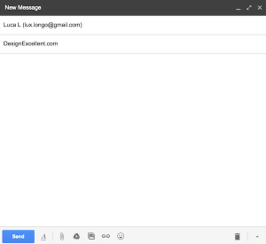
If we look at the user experience of Gmail, the interface is very simple and it looks like the first stage of a wireframe.
It has a very simple design, very simple colors (monochromatic) and it works!
The UX here is incredibly contextual.

Did you see that nice blue button “send” for sending the emails?
The color and the position, in this case, is more important than the text “Send”. They could have used a generic symbol instead of the text, with no impact on the user’s actions.
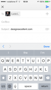
In fact, in the mobile app, they haven’t used a text in a button, but a simple blue Arrow-Airplane icon that stands in such stark contrast to the rest of the page – and looks sufficiently button-like – that users have no choice to consider it as the primary call-to-action.
How to grab the user’s attention with buttons?
Designing call to action buttons for web interfaces requires some discretion and planning; it has to be part of your prototyping process in order for them to work well.
You can create a great call-to-action button for your website and improve its conversion rate drastically by combining scientific studies on color with some design principles. In my projects I’ve always considered 6 important tools to achieve this:
- Position: It’s very important to give your CTA button a prominent placement. The placement of buttons is critical to drawing the eyes of visitors. Placement in prominent locations (distinguished area, top or center layout, in the angles for form’s buttons) can lead to higher conversions because users will likely notice the call to action button and take action;
- Clear message (or icons for mobile devices): Use the right words, be original, and use verbs to encourage actions (buy, download, watch, test, etc.). By experience, there is a big trust problem in the user’s feelings. To increase click conversion and to build trust, anticipate users’ skepticism and tell them what they will gain by taking the action you’ve presented to them.
- Shape: Rectangular buttons are better than circular ones;
- Size: The size of an element relative to its surrounding elements indicates its importance. Remember: the larger the element is, the more important it is. Decide how important certain site actions are, and size your buttons accordingly.
- Colouring: I believe the most important part is deciding what colors use for call to action buttons because they interact with the psychology of the users. I suggest to use colors with a high contrast relative to surrounding elements and the background;
- Offer alternative actions: A web page can have multiple calls for actions. Sometimes it’s necessary to offer a secondary action in order to convince the user to later take your desired primary call for action.
The Psychology of Colours
Now I have a question for you: Do colors really matter for conversions?
It’s a well-known fact that colors can provoke emotions, every color evokes a different feeling or mood with people and, therefore, results in a different reaction when seeing the color (of course, it is relative as different cultures perceive color differently). So, choose the color of the call-to-action button depending on the emotion you want to inspire.
For example:
- Red: Power, passion, love, negative;
- Green: Growth, money, environment, positive;
- Blue: Trust, peace, loyalty, safety, positive;
- Black: Formality, luxury, sophistication, neutral;
- Grey: disabled;
- Brown: Outdoors, food, earth;
- Orange: Confidence, cheerfulness, friendliness;
- Purple: Royalty, mystery, spirituality;
Another tip: Contrast is the key!
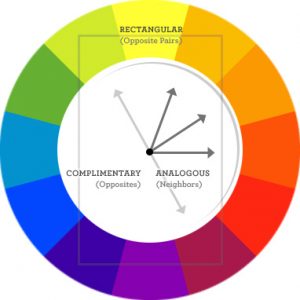
You can use a complementary color for the background if you want a design element to stick out.
I suggest choosing a color that is less prominent (relative to the surrounding elements and the background) for large buttons, and brighter color for smaller buttons. But whatever color you may choose, make sure you design the button in such a way that it is noticeable without interfering with the overall design.
Remember, contrast isn’t just about complementary colors on the color wheel. It’s about value.
A light button won’t stand out against a light background as a dark button would. On top of that, the copy needs to stand out against the button, too.
Best Practices for Buttons
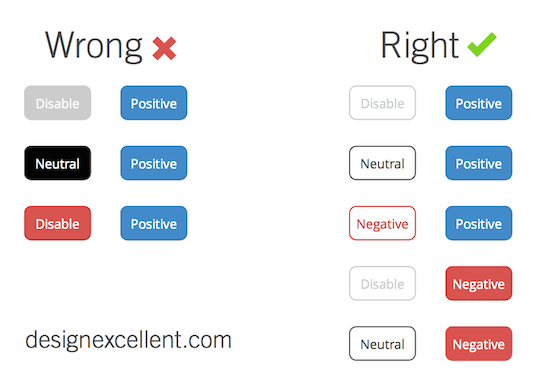
Well, now I am going to show you the simple guideline for buttons that I’ve used for my customers in their CTAs, forms, and popups (so take this as an example).
As I told you before, I identified a few colors to represent four important feelings:
- Positive (CTA: Save, Send, Download): Blue, Green;
- Negative (CTA: Delete, Block, Reset): Red;
- Neutral (CTA: See more, Alternatives, Discover): Black;
- Disable: Grey;
So, if we use for this example a white background, you can feel better what I meant before about coloring and contrast:
If the contrast is the same for two buttons very close to the screen, the attention of the users will be confused. As you can see, color plays an important role in the User Experience (UX) of your product, driving your users to the action.
Free Extra Resources
Join our FB Exclusive Group to get access to extra resources, it’s FREE.


