Wireframing a website is a design method that starts after the UX designer clarifies the general structure and navigation patterns of a product (Research + Usability + AI). It’s like a skeleton of a website or app and it connects the conceptual structure to the product’s visual design.
The wireframe explains the general layout of the product interface, defines the rules for displaying information, the hierarchy, and the behavior of its elements. It also allows you to layout the elements of the page before making decisions about visual design details like fonts, icons, and colors. Wireframes are a useful tool for building an interface before refining the details of the style and user interface (UI).
Wireframes are a kind of architectural model used to visually represent the skeleton at the base of your interface. They link the conceptual structure to the visual design of the product. They also help decide how you will create the information hierarchy, the priority of content, and help users clearly see the next steps.
A wireframe can be very useful design documentation, and it can provide interactive details to your team – specifically for the front-end developers who will implement the design.
[If you want to learn how wireframing a website for your project, sign up for our interaction design course, we have a chapter with exercises dedicated to this topic]
Like all design processes, wireframing a website is iterative. Start by looking at your site maps, flowcharts, requirements, and sketches and think about the visual layout of your website.
For example, here is a wireframe from the Facebook home:

Wireframing a website can include the following parts:
- Layout: the hierarchy of information and functions
- UI elements: the range of elements and functions available (various icons)
- Flow: the rules for displaying certain types of information (arrows or gestures are used)
- Annotations: how different scenarios affect what is displayed in the interface
Table of Contents
Wireframing a website: High and Low fidelity
Like drafts, low-fidelity wireframes help you get your ideas down quickly so you can think about them and refine them.
Low fidelity wireframes rely on geometric shapes to abstractly represent content. Sometimes at these levels, designers use incomprehensible texts (unless you know Latin) called lorem ipsum. While this simplifies the design, it is often better to use real text because it is an important type of content used to name, categorize, and communicate.
Low-fidelity wireframes are fine for collaborative teamwork because they are not too specific. They allow you to discuss important decisions with your team – such as what the focus of the page is – rather than unimportant UI decisions – such as the type of arrow used for a drop-down menu.

Because of its low level of detail, a low-fidelity wireframe can only communicate basic user flow and user experiences, without any real example about small details of a page. So, for people who don’t work in UX design, it may be difficult to understand how a wireframe works without seen more of these details.
So, wireframing in low-def is good only for conceptualize the ideas, not testing them.
This is where mid-fidelity and high-fidelity wireframes come in. High-fidelity wireframes rely on precise placement, spacing, and oftentimes actual copy to portray the look and feel of a design.
The benefits of a high-fidelity wireframe are many:
- Explains how the product works, which is really helpful for developers and other people involved in the project.
- Show a lot more detail, which makes it easier to produce a test on the wireframe (see guerrilla testing for example).
- It also provides a preview of how the UI elements might look like.
The common tools of low fidelity wireframes are whiteboards, paper, and pen, but also digital tools as well.
Instead, high-fidelity wireframes are more detailed – they faithfully reflect how your interface will look and how it will work exactly.
For high fidelity wireframes, many designers use Omnigraffe, Sketch, and Adobe XD.
In any case, the tool is not as important as you think, which means that you should choose the tool with which you feel most comfortable.
[If you want to learn how wireframing a website for your project, sign up for our interaction design course, we have a chapter with exercises dedicated to this topic]
Wireframing with annotations
Imagine that you designed an app or website, and you need to communicate how it works to your team. Use annotations are the best way to do it, you can explain how works every section or even a small element on it. You can also describe the behavior in case there will be animations or gestures, which is usually impossible to explain without annotations.
An example of an inspirational Wikipedia redesign with annotations and icons.

Don’t forget about the design states like active, disabled, logged-in, logged-out, blank state, etc. With annotation, you can note how an interface might display this kind of information.
What’s a wireflow diagram
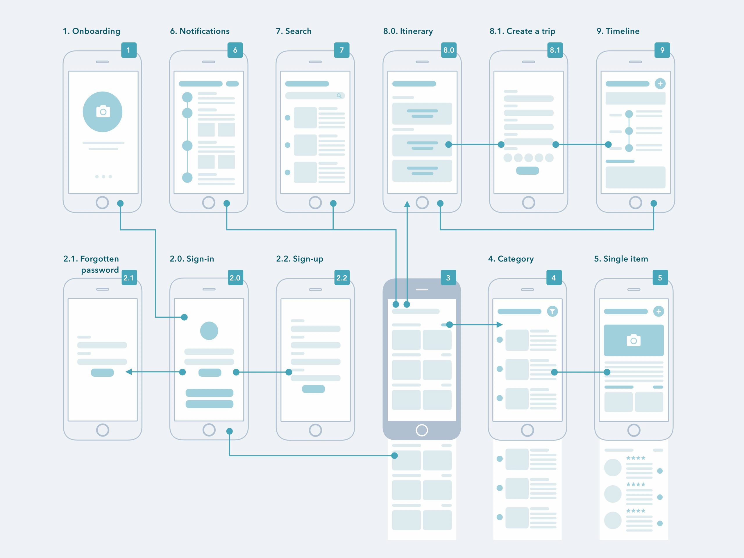
A wireflows is a mix between a wireframe and a user flow diagram. They are essentially wireframes connected with arrows and annotations.
According to NNG, wireflows are defined as “a design-specification format that combines wireframe-style page layout designs with a simplified flowchart-like way of representing interactions”.

Source: Casandra Sandu – Dribbble
This representation of the wireframe helps us think in terms of flows, and not only screens. With wireflows, we don’t work screen by screen but it’s important to consider the full flow of interaction.
For example, imagine an onboarding flow where the user has to register and add relevant information. Using the wireflows we think about how to optimize the full flow and try to identify the best way for our user to complete the onboarding without a high exit rate.
Difference between Wireframe and Prototype
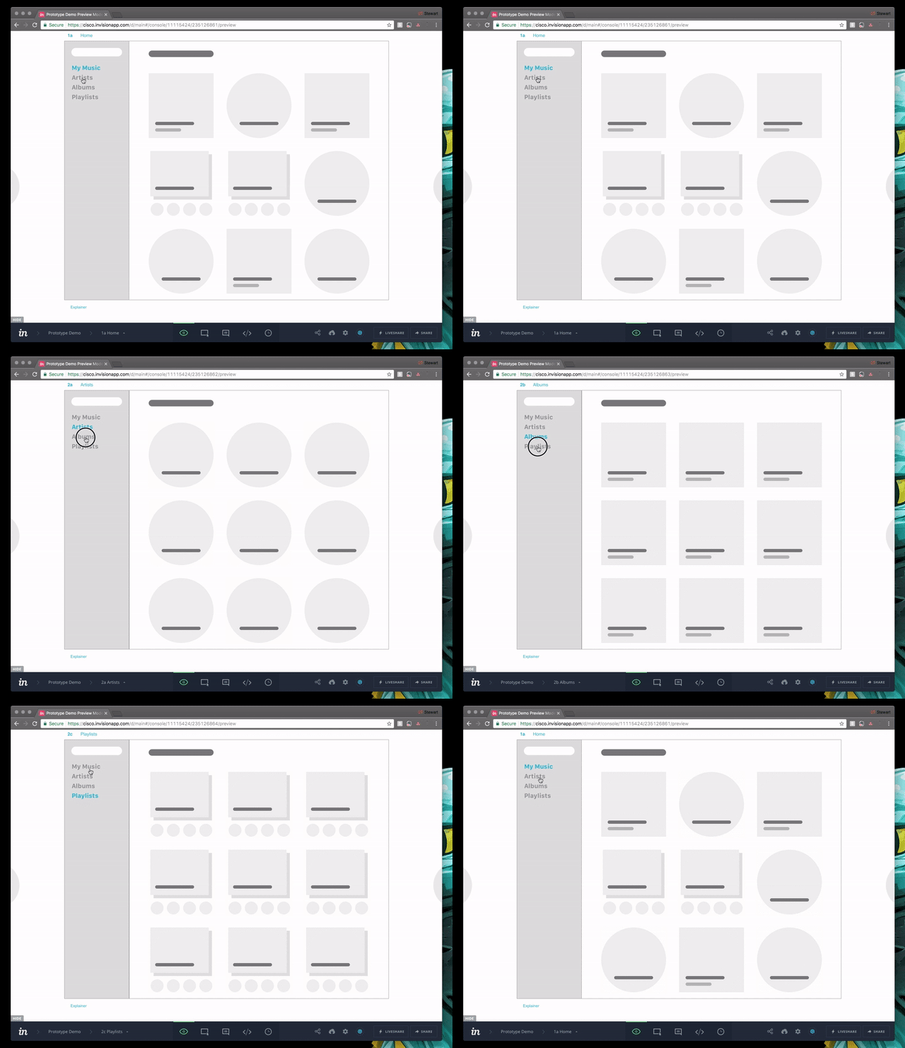
An alternative to show how your wireframe works are building a prototype. It’s an efficient way to show how an application works without actually writing any portion of code and with a relative cheap cost.
The prototype is interactive, so you can actually test it by clicking on the elements, navigating between pages, and so on. The great thing about a prototype is that it allows your team, or the developer team and the rest of the stakeholders, to test it and get a sense of how it will feel and function once it’s completed. You can also understand if there are limitations on the technology side and make changes (which costs way less than discovering the same issues after the development).

Source: invision.com
Wireframe: gestures
A wireframe document of how information and interactive elements will be prioritized, such as action buttons, input fields, and hyperlinks.
You can also define how the interactive elements of the product work.
For example, in this wireframe we use the gestures superimposed on the layout to demonstrate how we can interact with the various elements of the UI:

As we have seen above, annotations play a very important role.
Wireframes use annotations, or notes in the margins, to add descriptions, rules, or explanations on how the element works, and any other useful information. Usually, this is done by placing a colored number in an interface element and then using the same number to associate the annotation at the bottom.
[If you want to learn how wireframing a website for your project, sign up for our interaction design course, we have a chapter with exercises dedicated to this topic]
Wireframing Tools
- Free wireframe template: link
- A set of tools to simplify wireframe creation: links;
- Excellent collection of templates for Sketch: link
- Why wireframes are so important in UX: article
- 20 tools to create wireframes: link
- 48 tools for wireframing: link
Extra Resources
- Join our FB Exclusive Group to get access to extra resources, it’s FREE.
