Today you are going to learn how to increase your online e-commerce sales by applying 4 simple UX tips.
And trust me, your online sales will definitely increase.
This article comes from a recent consultation I did for a customer who operates in the accommodation market.
Applying those four tips, we increased online sales by 18%.
That’s fantastic.
Table of Contents
1- Urgencies
If your users are planning to go away and think about booking later, an urgent message might change their minds.
It’s a useful strategy, as it forces users to come to a faster decision about a purchase.
Coming into the tourism and travel market, urgencies can be an even more valuable strategy.
Tools like countdown clocks and low stock levels can focus the traveler’s attention.
We have to say that it is considered as a sales technique. But it’s not a lie.
The data should be real and help the user to choose with transparency in order to decide how urgent the purchase is. It’s not about forcing users down the conversion path, but instead to show them that it’s more beneficial to complete their shopping process now rather than delaying.
We can see a great example in the accommodation websites, like Expedia or Booking.com

This is how Expedia use Urgencies
I created two red rectangles to highlight the urgency messages.
When can we use the urgency technique?
It’s easy when it happens in at least one of these four cases:
- Limited stock levels or availability;
- Limited time to claim discounts;
- Improved shipping offers;
- Dispatch dates.
Here a list of urgency examples that I collected from accommodation websites:
- Occupation level: “80% reserved”, “Madrid is a top pick amongst travelers on your selected dates (50% reserved). Prices may be higher than usual for the dates you have selected, why not try again with these alternatives? (Offer alternative dates before and after the requested dates)”;
- Expiring special offer: “Hurry up! This is a limited offer on our site!”, “Daily deal – expires in 2:45:29 (countdown)”;
- Special offer alert: “This is a special offer”;
- Last Booking notifications: “Last booked: XX hours ago”, “This hotel was booked 10 times in the last 24 hours”, “The last booking in Madrid was 24 hours ago”;
- Other User behavior: “There are 10 people looking at this hotel”;
- Availability and Stock level: “There are only 3 rooms left!”, “Hurry Up! This is the last room”;
- Prices status: “Prices in Barcelona have been increasing on your dates over the past 16 days.”, “Prices in Barcelona on your dates are the lowest we’ve seen in 18 days”.
2- Encourage Messages
As a Customer Experience (CX) consultant, I always discover a common mistake made by my clients: companies don’t think about selling the obvious!
What????
I try to make it easy.
Are you (as a company) giving your customers the best price? Are you using the fastest payment method? Are there any hidden costs applied to your product?
Put all of those messages in evidence. Highlight them. Sell them!
The UX process is not so complicated.
Once you have mapped out the user journey, you have to customize the touchpoints well. Put your attention on the Call-to-Actions and design around them. For many users, personalization with positive reinforcement and clear messages will encourage user engagement.
This is the example from Expedia (again), with the product page providing all the options. I highlighted the encouraging messages in blue and left the urgencies in red (as before).
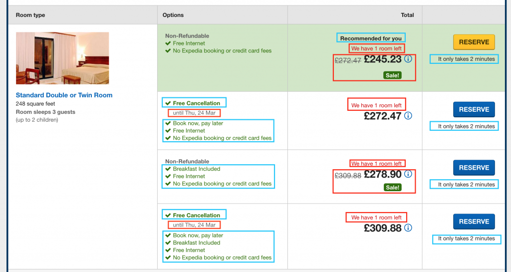
This is how Expedia uses Urgencies + Encourage messages
Here is a list of examples that I collected from accommodation websites:
- Best Price: “Best Price Guarantee”;
- Fast process: “It only takes 2 minutes!”, “No waiting – get instant confirmation”;
- You chose well: “Congrats! You picked the cheapest room at Hotel XXX. Don’t miss out, book now!”, “Great! This is the cheapest price for this hotel”;
- Cancellation policy: “Free cancellation”, “You can make changes or cancel this booking online before <date>”, “Don’t worry, book now and make changes for free until <date>”;
- Pay Later: “Book now, pay later”, “This guarantees your booking, don’t pay now”, “You will not be charged until you check-in or check out of the hotel”, “No payment needed today. You’ll pay during your stay”;
- Product ratings: “This hotel has an excellent location, it was rated 9.5 by our customers!”;
- Costs: “No hidden costs, no credit card fees”;
- Extra Services included: “Sea view”, “Jacuzzi”, “Swimming pool”;
- Multiple Payment options: “Pay online or at the hotel”;
- Support: “Need help? Contact us [contact]”, “24h customer support”.
3- Trust Builder Messages
Let’s first review of why this technique is powerful.
With Trust Builders we are able to send clear messages through our website. There are many similarities with the Encourage Messages
Why are they important in eCommerce?
Because people can distrust your company, they can go to another website to verify information, they can get suspicious and decide to not purchase, and they can abandon your website and leave negative feedback.
Now let’s take a look at this banner that appeared in the checkout of Booking.com:
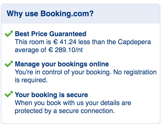
What do they mean with those messages to the customer?
- Booking is a company that cares about its users by giving them good quality services;
- The prices are very good;
- Payment is secure, the customer is in good hands. Privacy and security are key concerns for customers;
- It’s a fast process and the customer can control it at any stage;
Booking.com is just one example. There are plenty of eCommerce companies with Trust Builders Messages.
Here a shortlist of other examples that I got from other websites in the same business industry:
- Partnership: “We are a partner of [big_player]”;
- Personal Data: “We won’t call you for marketing purposes”;
- Safe booking: “Secure booking (it only takes 2 minutes)”, “You can count on us: – We use secure transmission – We protect your personal information”;
- Payment methods: Valid credit cards, PayPal etc.;
- Certifications: WorldPay, Thawte, etc.;
- Feedback ratings: Tripadvisor, TravelAppeal, etc.;
4- Colours
I have already visited the UX tips on using colors here.
Using the right colors is a ridiculously simple way to increase your conversion rate.
I believe that one important part is knowing how to use colors on your eCommerce website because they interact with the psychology of the users.
If you take a look at the example of above, did you notice that Trust Builders and Encourage Messages are in Green?
And the Urgencies are Red?
Let’s have a look at another example of Booking.com
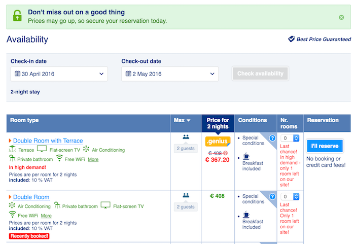
For example:
- Red messages: Urgencies;
- Green messages: Encourage Messages;
- Blue: Call to Actions, Info, Names.
- Black and Grey: Secondary messages.
All those examples illustrate that colors really matter for conversions in eCommerce.
It’s a well-known fact that colors can provoke emotions, every color evokes a different feeling or mood in people and therefore results in a different reaction when seeing the color (of course, it is relative since different cultures and countries react differently to different colors).
For example, some color meanings are as follows:
- Red: Power, passion, love, negative;
- Green: Growth, money, environment, positive;
- Blue: Trust, peace, loyalty, safety, positive;
- Black: Formality, luxury, sophistication, neutral;
- Grey: disabled;
- Brown: Outdoors, food, earth;
- Orange: Confidence, cheerfulness, friendliness;
- Purple: Royalty, mystery, spirituality;
Conclusions
The idea is to create a strategy to put the potential purchase on “steroids”, to do that we can use four techniques:
- Push the user to buy quickly: Urgencies;
- Remind to the user of all the “hidden” features included in that price: Encourage messages;
- Make the user feel secure and safe in the online zone: Trust Builders Messages;
- Play with the last three tips by using colors wisely.
Free Extra Resources
Join our FB Exclusive Group to get access to extra resources, it’s FREE.

