Hick’s Law states that the time required to make a choice depends on the organization of elements on a website or app, as well as the available alternatives, unnecessary steps, too many choices or information, and the structure. We are talking about information architecture and therefore interaction design.
Optimizing the information architecture in this sense could greatly affect the design of elements such as menus, lists, and search results.
As UX Designers, our main role during the design of digital products or services is to simplify complex interfaces for users.
Too much information or redundancy can unnecessarily overload a user’s cognitive functions, hindering navigation and intuitive experience. To learn and simplify correctly, we must analyze users, understand their goals and frustrations, and try to eliminate unnecessary elements of the experience that do not contribute to their goal.
We can study users and their goals in the User Research phase, starting with empathy maps and personas, followed by customer journey analysis. Meanwhile, analyzing the information architecture can be done through tests such as card sorting, tree testing, and even usability testing oriented towards navigation or structure of elements.
By utilizing Hick’s Law, we can prevent this cognitive complexity from extending beyond the user interface and potentially affecting processes.
Table of Contents
Hick’s Law: What is it?
We have often talked about it during our user research and interaction design courses, it is not the first time we see a topic in the psychological field laying the foundation for a theory to be applied to good user experience design of a digital product. In this case, William Edmund Hick was a psychologist who introduced Hick’s Law in 1952, which analyzed the connection between the number of stimuli and an individual’s response time.
His theory demonstrated that increasing the number of options for choice results in a logarithmic increase in decision time.
In UX design, this concept is extremely important. The excess of choices in today’s market risks leading us into a phase of non-choice, which creates problems for us UX designers.
In fact, the longer users interact with an interface, the lower the percentage of conversions and sales.
Therefore, complex or confusing interfaces that lengthen decision times for users should be considered inefficiencies in the design phase, as users must first process all available options before selecting the most relevant one for them.
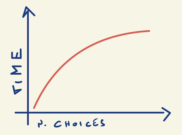
Cognitive load is the key element of Hick’s Law, but a higher load does not depend only on the number of choices. There are also other factors we must keep in mind.
Hick’s Law: the cognitive load
A user who lands on a website or app surely has a specific purpose, during their interaction, they will have to analyze the elements on the page before understanding how to achieve their goal: they will go from navigating, understanding the layout of the page and its visual hierarchy, to interacting with the UI components and completing any forms.
According to Hick’s law, this process can be difficult because the user must always remain focused on their original intention, so if the interface is not simple, this task will be much more difficult and the amount of mental energy required, and therefore cognitive load, will be high.
The three elements that affect cognitive load are:
- Excess of information;
- Familiarity with data;
- Inefficient or non-existent grouping of information.
Let’s examine them in detail.
Hick’s Law: excess of information
The human brain is like a computer, it has a memory that if exhausted can slow down performance or cause a crash. When we receive too much information and exceed our available mental space, it can lead to fatigue in performing tasks we want to execute, and many details that could be essential may escape us.
In terms of user experience and design, these issues related to information overload are detrimental and can cause an increase in abandonment rate or bounce rate, a decrease in conversions, and micro-conversions.
The user may feel lost within the website and unable to find the right path to solve their problems, resulting in a negative user experience.
Hick’s Law: familiarity with data
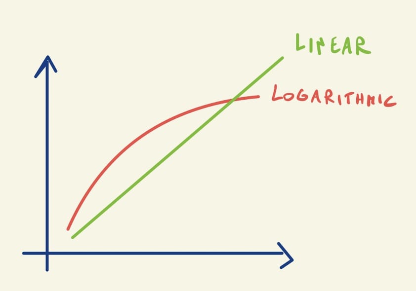
If we look at the previous graph, in fact, we can see that the logarithmic function starts to stabilize over time, indicating that there is no direct proportionality and that an increase in the available time, due also to a recurring user, can help the user and make the interaction simpler.
Let’s consider B2B software for the travel management of a tour operator. This software presents hundreds of options, including flight search, hotel search, train search, filters, offers, payments, invoicing system, CRM, email marketing, automation, and much more.
Now let’s think about a new employee of the company on their first day of work: their cognitive load will be stressed, too much information and little familiarity with the system.
But after several hours and as the days pass, everything will become simpler and after a few months, even very simple and fast for them to perform any operation.
This is exactly what Hick’s law explains on the right side of the graph: the degree of habituation over time helps to lower the cognitive load.
Hick’s Law: grouping information
As seen previously, time is an important element. It decreases when information is presented in an efficient order or grouping.
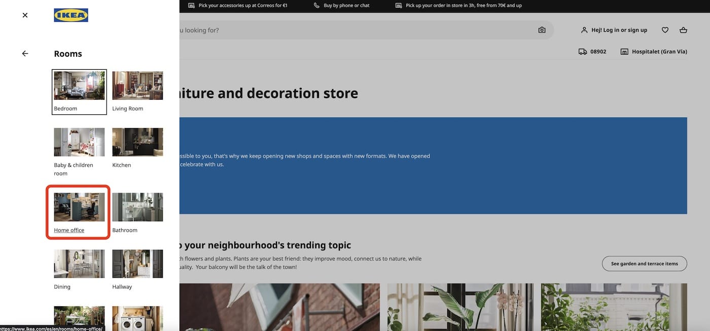
Let’s imagine designing online furniture e-commerce and listing all products on one page. The user would be stressed searching for an office chair among tables, sofas, lamps, beds, wardrobes, etc.
Instead, if we created groupings like Rooms->Office, the user experience would be improved.
And then Office->Chairs.
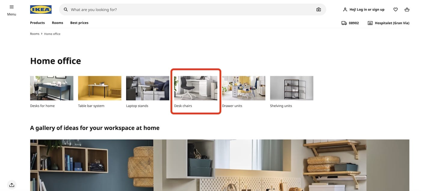
With these two groupings, the user will be able to find the right way without stressing too much their cognitive load, thus obtaining a pleasant user experience in a system full of products.
It is important to understand that even groupings must be well-designed.
For example, if we had created a different grouping method, such as by color, we would not have obtained the same results.
In fact, a user searching for an office chair facing a color categorization would not simplify their experience by choosing black because they would always get a very long list of items that are not very related to their search criteria. They would find black sofas, black wardrobes, black shelves, black kitchens, etc.
If we look again at the previous graph, with the addition of Hick’s law formula:
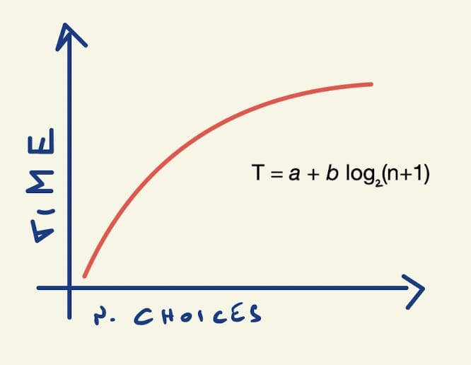
We will begin to understand its significate well:
- T is the time to make a choice;
- n is the number of possible choices;
- a is the grouping;
- b is familiarity.
Hick’s Law: Examples
Now that we have understood Hick’s Law and the concept of cognitive load, we can look at some examples to understand and demonstrate this principle.
In one of my favorite books on the subject, Laws of UX by Jon Yablonski, several interesting examples are cited.
The first example is about TV remotes, which have become increasingly complex over time with the increase in TV functionality (which is also full of apps). The poor inclination towards user experience-optimized design has meant that TV remotes added more and more buttons and increased their complexity.
Who hasn’t seen the meme about “grandparent remotes” with useless buttons taped over with scotch?


In all these memes created by users to joke around, there is an underlying truth: complex interfaces, full of available options and poorly organized, increase the user’s propensity for errors (in this case, elderly users) and degrade the overall user experience.
On the other hand, by making simple modifications, such as adding masks made of adhesive tape or paper, the grandchildren have improved the usability of remote controls and reduced their complexity.
This problem still exists in 2023, as not all TV manufacturers have sought to improve the UX of their television remotes.
This is a modern remote control from a well-known TV brand that always maintains its complexity.

Apple, which has based its success on attention to design and user experience, has created very simple and elegant models by reducing the buttons to only those strictly necessary.
The result is a remote control that divides the cognitive load using the grouping principle we talked about earlier and shifts the complexity to the TV interface, where the information resides on a larger space and can therefore be organized and displayed optimally.

Now let’s see an example in the digital world of the Hick’s Law.
The fact that navigating and searching through websites with large quantities of products is more difficult does not mean that we should design websites with fewer products, but rather study how to design them well. Amazon has designed its search engine well by providing many alternative products at the right time and not all at once.
If we search for “Harry Potter”, before showing us the search results, Amazon’s algorithm, not knowing which Harry Potter-related products we are looking for, shows us a page where at the very top there is a grouping by categories on Harry Potter: Books, Games, Clothing, Video Games, etc.

In this way, it improves the user experience that starts searching for a product based on their main search criteria, “Harry Potter”, and subsequently thinks about the various subsequent steps (T-shirts->Women->Size S) to get to the desired product.
Hick’s Law: Design Guidelines
So far, we have always talked about the issues caused by the abundance of information present in the information architecture of a website or app, and their implications on user experience and conversions. Many alternatives can strain the user’s memory and attention, creating confusion, but there are techniques to optimize information as well.
Over the years, UX designers around the world have conducted studies on UX design, particularly on interaction design and information architecture, and have created design guidelines that seek to improve user experience by considering Hick’s law:
- Understanding the user and their decision-making process. Create user personas, empathy maps, and customer journeys with user goals and analyze data to understand their needs.
- Prioritize the most important options. Use the technique of visual hierarchy to organize and highlight the most important and relevant information.
- Reduce the number of choices. When possible, show only relevant ones.
- Break down complex information. While respecting the relevance principle to the user’s goal, it is preferable to show information gradually to avoid overwhelming the user with too much information at once.
- Use progressive disclosure. This is a technique that allows information to be displayed gradually as users interact with the interface. Show the most important information first in order of priority and then continue showing others in order of importance.
- Write clear and concise instructions and labels. This principle is one of the foundations of UX Writing: even texts are part of the user experience. Micro-copy and simple language help users better understand the available options.
There is a technique, which we explain in our interaction design course, that allows almost all of these guidelines to be applied: card sorting.
UX Design Guidelines: Cart Sorting
Card sorting is one of the most effective techniques to optimize information architecture based on user perceptions. It allows us to gain insight into how users reason with elements of your website (mental models) so that you can organize and label content in a way that makes more sense to your users.
In short, card sorting helps you create information that is easily retrievable for your users:
- The designer creates a list of contents for a digital project on a card (from a minimum of 20 to a maximum of 70 contents).
- Different users are asked to group them by similarity.
- Users can assign a title to each group.
- If the website already exists, an inventory of contents is taken. Otherwise, contents must be defined through surveys with stakeholders.
- Users are asked to assign an order of importance to the contents for each group.
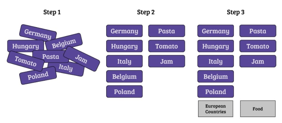
There are two methods to do it:
- Open card sorting: the user is free to classify the items into as many groups as they deem appropriate and label them as they wish. This way, we obtain information on the user’s spontaneous mental representations;
- Closed card sorting: the user is asked to place the items into some predetermined categories.
Hick’s Law: Conclusion
To become a UX Designer, you absolutely need to know Hick’s Law, which consists of demonstrating that users struggle to perform certain tasks and actions if the information they find increases their cognitive load and stresses their memory.
The cause of all this is the amount of information, the little time available to examine and learn it, and the inefficient grouping they have on the interface in question.
The best way to solve these problems while designing complex websites or apps is to first understand the user’s intentions and goals. Then, interfaces should be designed that reduce the number of choices, prioritize those preferred by the user, group them efficiently, and communicate clearly.
Every element that does not help the user achieve their goal should be eliminated or hidden.


