
A dark pattern is an interface element intentionally designed to trick users into doing something they wouldn't otherwise: signing up for a newsletter, sharing more data than necessary, paying for an unwanted service, or making a subscription almost impossible to cancel.
The term was coined in 2010 by Harry Brignull, a UK UX specialist who created the website deceptive.design. Since then, the concept has evolved from an industry curiosity to a key regulatory concern globally, especially in Europe and the US. As of February 2024, the Digital Services Act (DSA) explicitly prohibits many dark patterns for large platforms, with fines up to 6% of global turnover.
By 2026, understanding dark patterns isn't just an ethical consideration—it's a matter of compliance, brand reputation, and legal protection. This guide introduces you to the 12 most common types with real-world examples, explains the updated regulations (like the EU's DSA and US FTC guidelines), and proposes ethical alternatives that perform better in the long run.
What you'll learn:
- The formal definition of a dark pattern (and why it differs from "aggressive design")
- The 12 types classified in the most updated taxonomy
- Real-world examples of companies fined (Amazon, Meta, Epic Games)
- What the DSA specifically prohibits and its penalties
- How to replace a dark pattern with an alternative that converts better
- Testing tools to identify dark patterns in your product
What is a Dark Pattern?
A dark pattern is an interface built to deceive the user about the meaning of their actions. The key is intentionality: it's not a design error; it's a conscious choice made to maximize a metric (sign-ups, sales, retention) at the expense of user well-being.
The formal definition from the UK Competition and Markets Authority (CMA) (2022) is clear:
"Dark patterns are design features that push, trick or manipulate users into decisions contrary to their interests or original intentions."
Three elements distinguish a dark pattern from merely "aggressive" design:
- Deception: The user doesn't understand what they are truly doing.
- Asymmetry: The action favored by the design is much easier than the action the user wants.
- Cognitive Exploitation: It uses psychological biases (urgency, fear of loss, defaults) to bypass rational thought.
A large, colorful "Buy Now" button isn't a dark pattern (it's legitimate sales practice). But a "Sign Up" button that implicitly activates a recurring subscription without clear disclosure is.
The 12 Types of Dark Patterns (Deceptive.design Taxonomy)
Harry Brignull identified 12 primary categories. Each stems from behaviors observed in hundreds of real products.
1. Confirmshaming — Guilt-Tripping to Sign Up
When refusing an offer requires clicking an option phrased in a humiliating way: "No, I don't care about saving time," "I prefer to keep losing money."
Example: Newsletter pop-up with choices like "Yes, I want to save" vs. "No, I hate discounts."
Ethical alternative: A simple, neutral "Close" or "No thanks."
2. Roach Motel — Easy In, Impossible Out
Signing up for a service takes one click. Canceling requires calling a number, sending a letter, or navigating through 5 confirmation pages.
Famous example: Amazon Prime was fined by the US Federal Trade Commission (FTC) for $1.6 billion in 2023 for making subscription cancellation extremely difficult.
Ethical alternative: Cancellation should require the same number of clicks as signing up. The EU DSA explicitly mandates this.
3. Forced Continuity — Silent Automatic Subscription
A free trial automatically converts to a paid subscription without clear prior notice. The user discovers the charge on their card weeks later.
Example: Some streaming platforms switch from a free trial to an annual plan of $79.99 (or £65 for UK users) with zero notifications 24 hours before expiration.
Ethical alternative: Reminder email 3 days prior + in-app notification + ability to cancel with 1 click.
4. Sneak into Basket — Unauthorized Cart Additions
During checkout, accessory services (insurance, donation, extended warranty) appear pre-selected. Users pay for them if they don't pay close attention.
Historical example: Airline booking sites that automatically added "travel insurance" and "priority boarding" to the cart.
Ethical alternative: Explicit opt-in, not pre-selected. Users add extras, not the system.
5. Disguised Ads — Advertisements Masquerading as Content
An article appears editorial but is sponsored. A "Download" button on a library page actually opens a paid advertisement.
Ethical alternative: Clearly mark sponsored content with visible labels ("Sponsored," "Advertisement"), graphically distinguish ads from content.
6. Misdirection — Visual Distraction to Hide Less Profitable Options
The "Continue with premium subscription" button is large, green, and centered. The "continue with free version" link is small, gray, and in a corner.
Example: Many freemium services hide the free version behind almost invisible links.
Ethical alternative: Give equal visual weight to options, letting the user choose based on value, not design.
7. Hidden Costs — Costs Hidden Until the Last Step
The price displayed in the listing is $29. In the final checkout, it becomes $47 for "handling fees, VAT, payment commission." The user is already emotionally invested in the funnel and completes the purchase.
Regulation: The DSA obliges platforms to show the complete final price from the first display.
Ethical alternative: Show the "all-inclusive" price from the first screen.
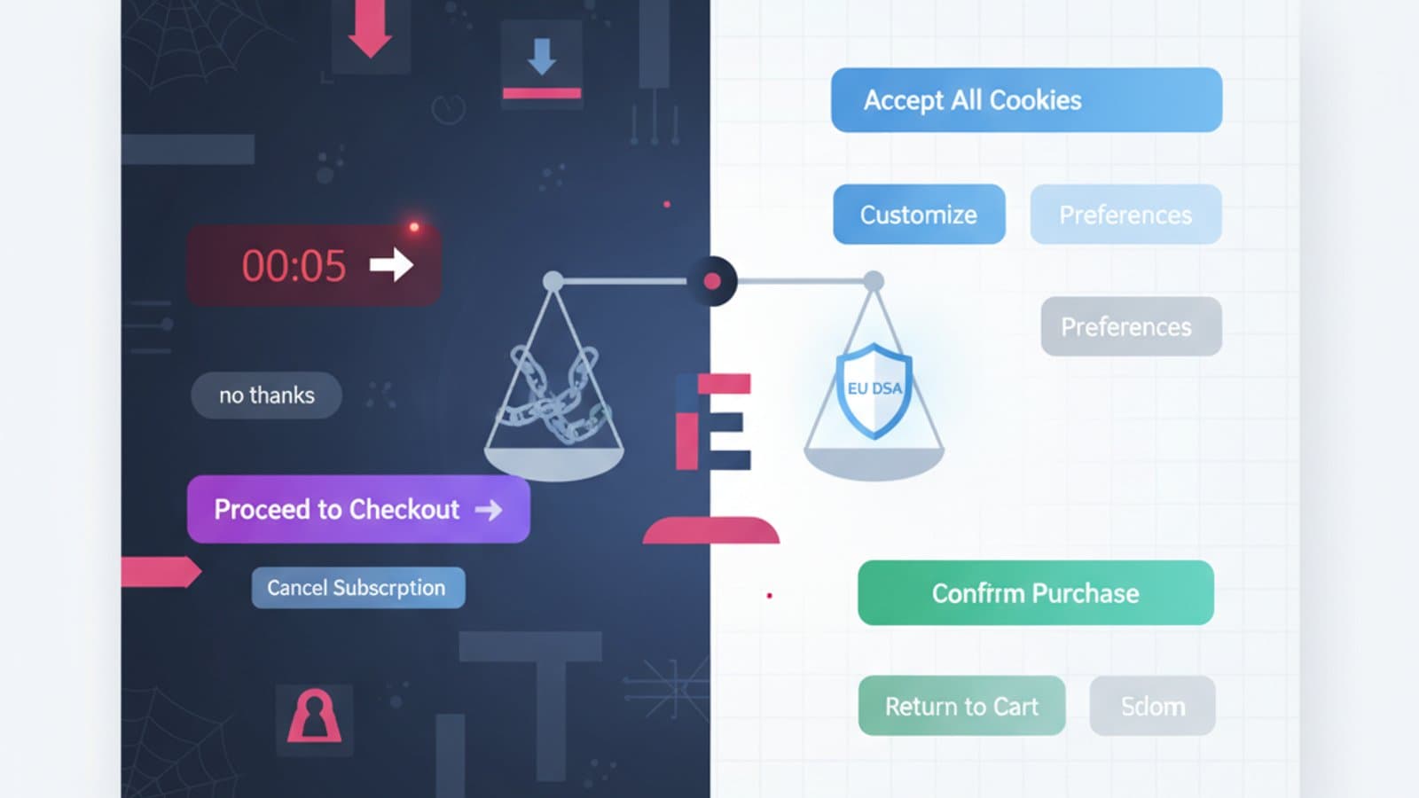
8. Privacy Zuckering — Forced Data Sharing Consent
The cookie banner has a huge "Accept All" but "Reject" requires 3 clicks in a hidden sub-menu. Alternatives are too burdensome compared to consent.
Regulation: The GDPR (2018) and the 2022 CNIL/EDPB guidelines already prohibit this behavior. A "Reject All" button must exist with the same prominence as "Accept All."
Ethical alternative: Symmetrical cookie banners with equal choices.
9. Trick Questions — Double Negative Questions
"Do you not want to not receive our communications?" By checking the box, the user doesn't know if they've consented or refused.
Ethical alternative: Positive and direct questions. "Do you want to receive our emails? [Yes] [No]."
10. Fake Urgency — Invented Timers and Countdowns
"Only 2 rooms left!", "Offer expires in 04:37", "37 people are looking at this product." All values are randomly generated or untrue.
Example: Booking.com has faced multiple fines for untrue urgency banners regarding available spots.
Ethical alternative: Show real urgency data only when it's genuine. Honesty builds brand trust in the long run.
11. Fake Social Proof — Invented Reviews
Reviews, testimonials, and star ratings generated by bots or written by company employees.
Regulation: The UK Consumer Protection Act 2024 and the EU Omnibus Directive 2022 prohibit fake reviews with penalties up to 4% of turnover.
Ethical alternative: Moderate real reviews, publicly respond to negative ones, encourage authentic feedback.
12. Nagging — Repeated Requests That Don't Accept No
The app asks to enable notifications. You say "no." On the next launch, it asks again. Then again. Then again. Until you give in.
Ethical alternative: Respect the first "no" for at least 30-60 days. Re-ask only if there's a change in context (new feature, new event).
What the DSA (Digital Services Act) Prohibits
The European Digital Services Act has been in effect since February 17, 2024, for all platforms. In Article 25, the DSA explicitly prohibits dark patterns on online interfaces, with this wording:
"Providers of online platforms shall not design, organize or operate their interfaces in a way that deceives or manipulates the recipients of the service, or in a way that substantially distorts or impairs the ability of the recipients of the service to make free and informed decisions."
Categories specifically prohibited by the DSA include:
- Asymmetric prominence of options (e.g., accept vs. reject with very different styles)
- Repeated requests after the user has already made a choice
- Making it more difficult to terminate a service than to start it
- Pushing decisions by exploiting cognitive biases
Penalties: Up to 6% of annual global turnover. For companies like Amazon or Meta, this translates to billions of dollars (or pounds).
Famous Dark Patterns with Real Fines
Amazon Prime — $1.6 Billion (FTC 2023)
In June 2023, the US Federal Trade Commission (FTC) sued Amazon for using dark patterns in at least 3 categories: Roach Motel (difficult cancellation), Confirmshaming (humiliating options to refuse), Nagging (repeated subscription requests). Fine: $1.6 billion.
Epic Games / Fortnite — $520 Million (FTC 2022)
Epic was fined for using manipulative patterns on minors within Fortnite: facilitated accidental purchases, inability to request refunds, and patterns targeting minors. $520 million fine, much of which was refunded to children.
Meta / Facebook — €390 Million (Irish DPC 2023)
The Irish Data Protection Commission (DPC) fined Meta for "hiding" privacy settings behind unclear UI and GDPR consent dark patterns.
TikTok — €345 Million (Irish DPC 2023)
Fined for dark patterns in managing minors' privacy: default settings that exposed data, making them difficult to change.
How to Replace Dark Patterns with Ethical Alternatives
The interesting paradox is that many ethical alternatives convert better in the long run. Not because users are inherently "good," but because they don't feel tricked and become returning customers.
| Dark pattern | Ethical alternative | Business impact |
|---|---|---|
| Impossible cancellation | 1-click cancellation | Initial churn +5%, LTV +20% over time |
| Hidden costs | "All-inclusive" price upfront | Cart abandonment -15% |
| Confirmshaming | Neutral options | Email opt-in -10%, brand trust ++ |
| Fake urgency | Real urgency when present | Stable conversion, repeat visits ++ |
| Privacy zuckering | Symmetrical consent | Brand trust ++, automatic compliance |
The numbers above are based on public case studies from companies that tested the transition (Booking, Patagonia, Basecamp have published similar data).
Tools to Identify Dark Patterns in Your Product
- Deceptive.design — Harry Brignull's "Hall of Shame," with updated examples of dark patterns and company names.
- DarkPatterns.uxp2.com — A research project from Purdue University with a public dataset.
- Manual UX audit — Once a week, try to cancel your subscription, reject cookies, or find the final price. If any of these actions are disproportionately difficult, there's a dark pattern.
- Heuristic review — During design review, add "Is it honest?" to Nielsen's questions. A quick checklist: If the user understood 100% what they were doing, would they still act that way? If not, it's a dark pattern.
Frequently Asked Questions
Are all dark patterns illegal?
No, not all are explicitly illegal. Many are contrary to sectoral regulations (GDPR for consent, DSA for large platforms, consumer directives for pre-contractual information), while others are "only" ethically questionable. However, the European regulatory trend is clearly towards their total prohibition.
Do dark patterns always work?
They work in the short term to increase metrics like immediate sign-ups or sales. But they erode brand trust, increase churn, generate negative reviews, and – today – attract regulatory penalties. In the long term, the ROI is almost always negative.
How do I convince a product manager that dark patterns aren't worth it?
With three arguments: (1) real and documented penalties (Amazon ($1.6 billion), Epic ($520 million)); (2) measurable churn increase when a user feels deceived; (3) reputational risk in the age of social media (a single viral TikTok exposing the dark pattern is enough). If the PM still resists, propose an A/B test comparing an ethical vs. manipulative approach and measure LTV (lifetime value), not just instant conversion.
Is the "Accept All" button on cookie banners a dark pattern?
Not by itself. It becomes a dark pattern when "Reject All" is hidden, requires more clicks, has less readable text, or an asymmetric position. GDPR and EDPB guidelines require symmetry between the two options. If you're designing a cookie banner, ensure "Accept" and "Reject" have equal visual weight.
How can I learn to recognize dark patterns in my daily work?
Three exercises: (1) every week, spend 15 minutes on deceptive.design reading new reported examples; (2) when using a digital product, ask yourself "what does this screen *really* want me to do?"; (3) discuss dark patterns found in your product with your team in a monthly "ethical review." In our UX course, we dedicate a specific module to design ethics — also read our guide to Nielsen's heuristics for the classic framework.
Next Steps
Design ethics has evolved from a philosophical topic to a business requirement. Designers who can recognize and reject dark patterns, offering ethical alternatives that convert better, are among the most sought-after profiles in the global market by 2026—especially in finance, e-commerce, and B2C services that must manage DSA compliance.
The CorsoUX comprehensive UX Design course includes a module dedicated to ethical UX: analysis of famous dark patterns, ethical refactoring workshops, and study of DSA/GDPR regulations applied to design. You'll graduate with a portfolio demonstrating ethical sensitivity, increasingly valued by recruiters at serious companies.
To learn more:
- Nielsen's 10 Usability Heuristics — the fundamental principles of an honest interface
- WCAG 2.2 and Web Accessibility — the other pillar of ethical design, mandatory by 2026
- UI Design: Fundamental Principles — how to use visuals to help, not deceive


